Riffing on Matisse
I thought I would start writing down initial ideas in this blog.
My first musings are on Matisse who spent the last decade of his life largely bedridden after undergoing cancer surgery in 1941. The surgery forced a change in how he lived and worked. Unable to stand at an easel, he developed his series of paper cutouts.
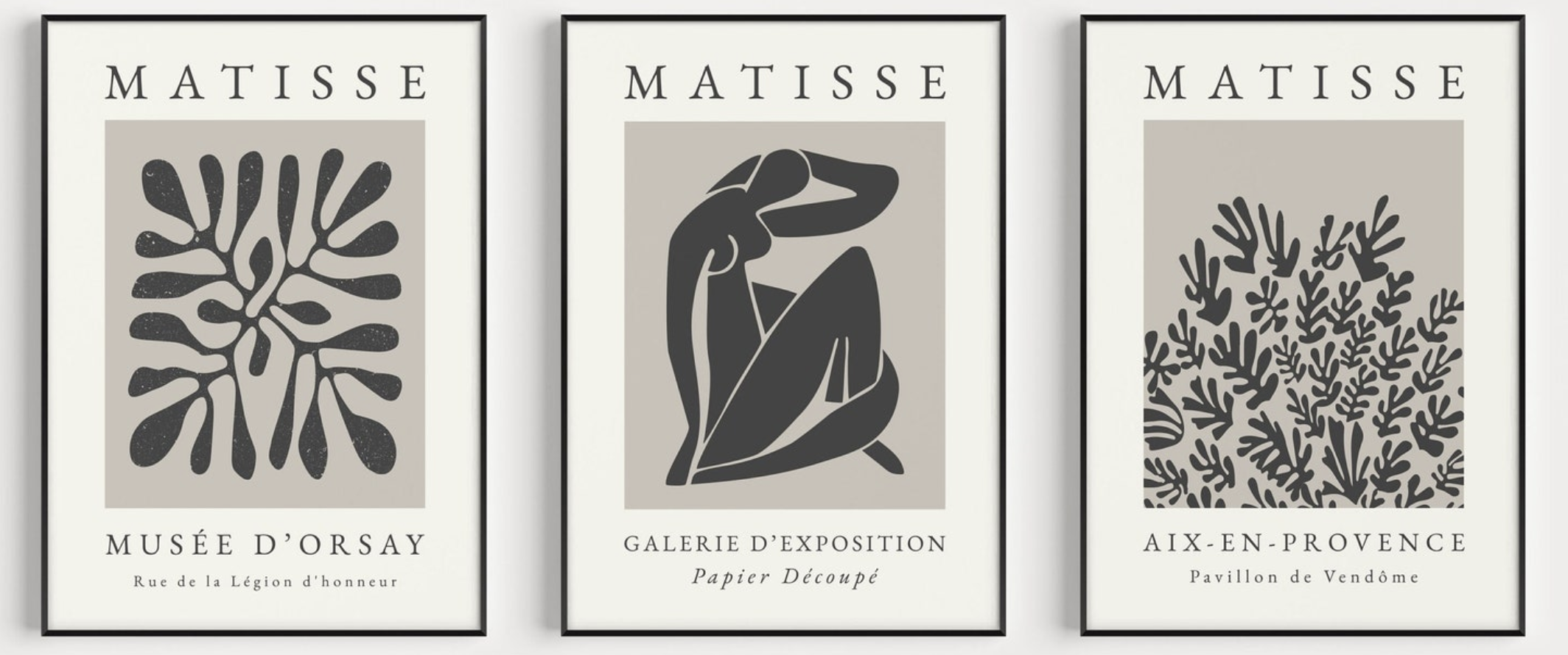
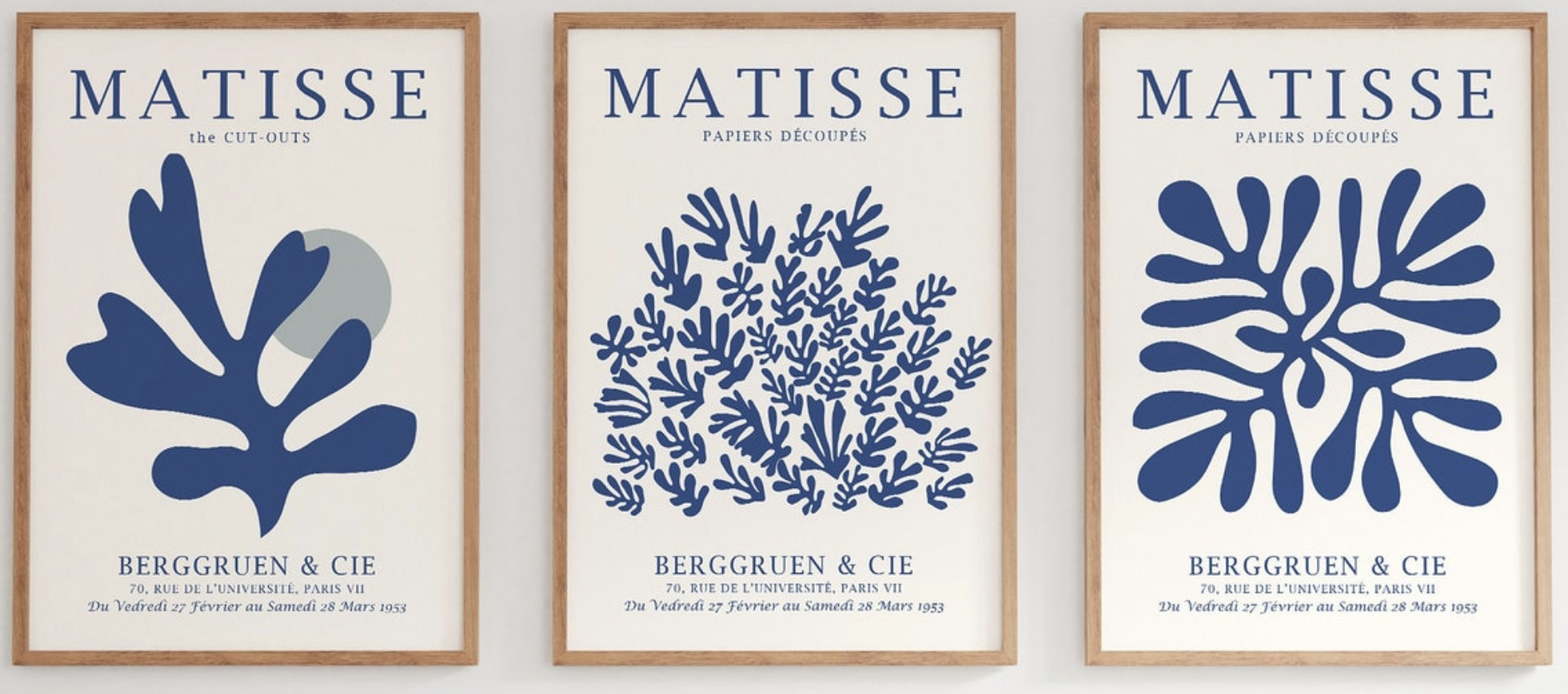
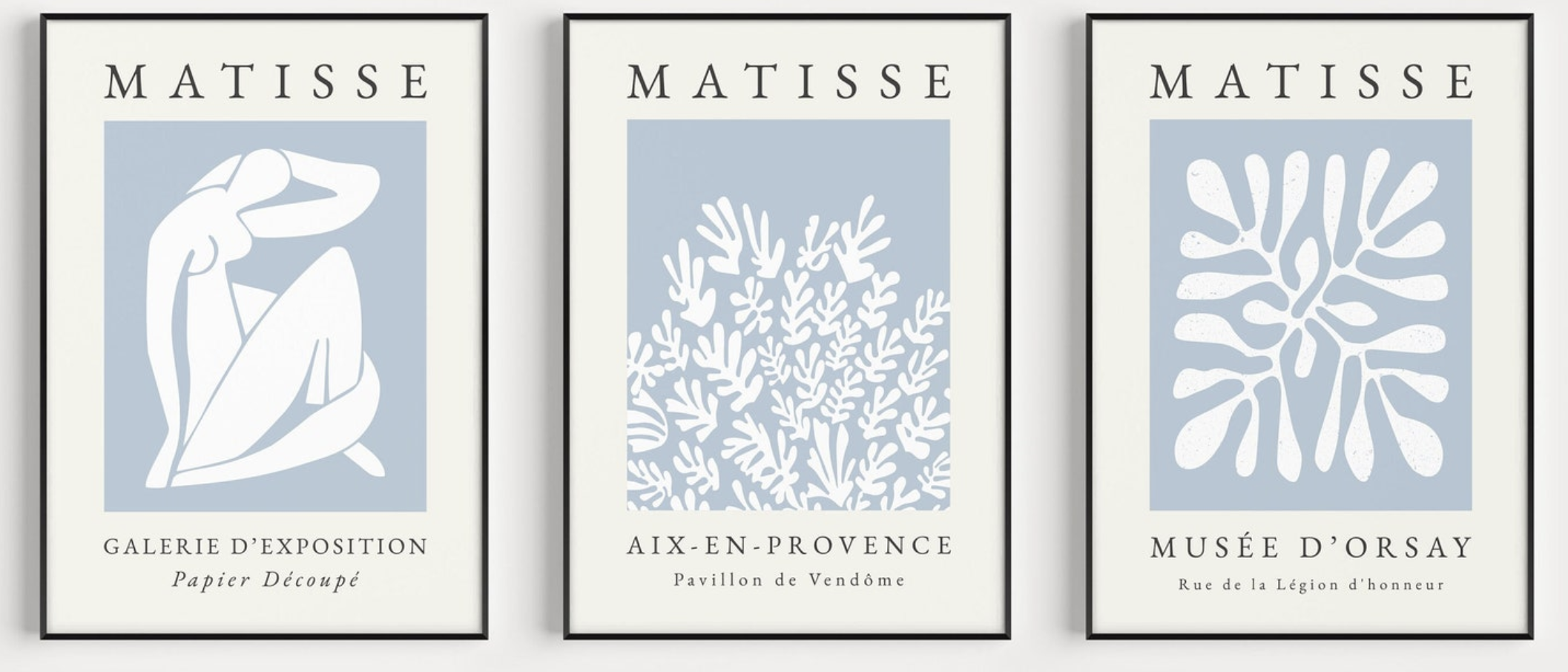
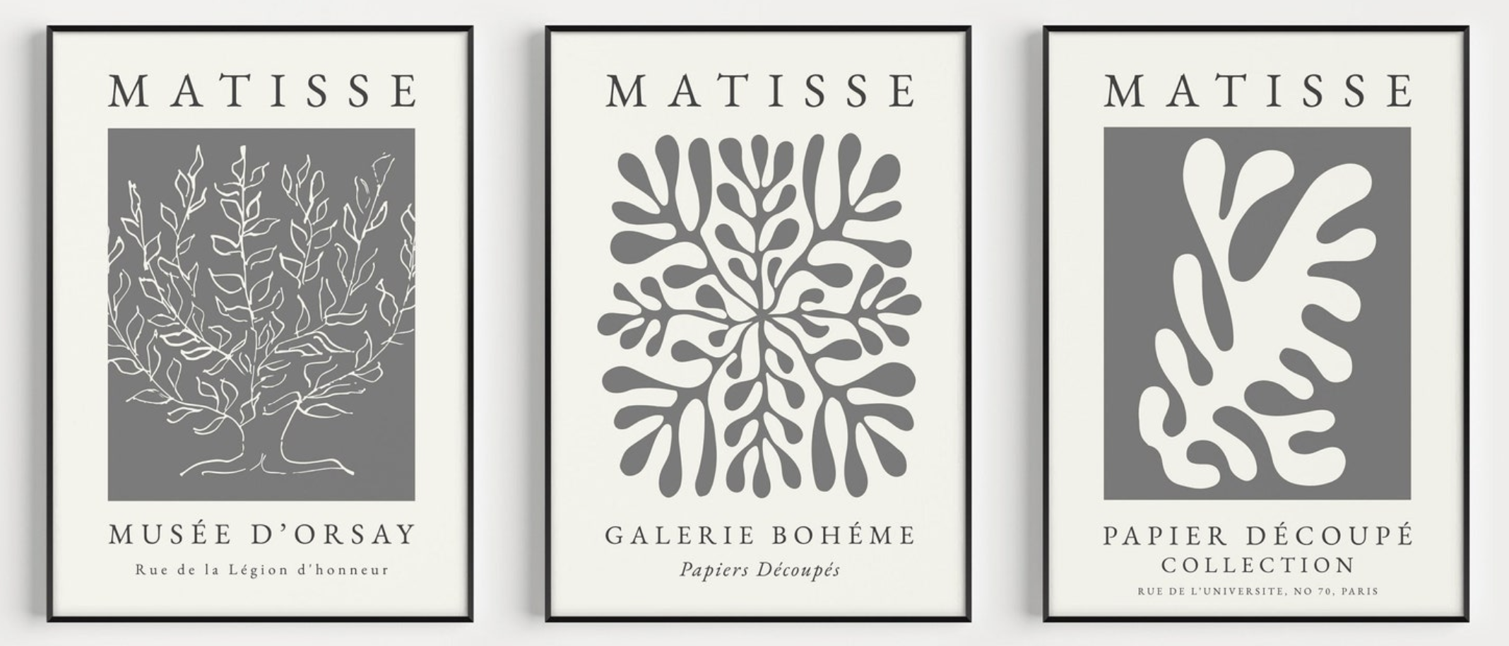
I’ve been thinking about how graphic designers have worked with Matisse’s imagery over time, especially in exhibition posters. In the early 1950s, the Paris gallery Berggruen & Cie produced posters for Matisse’s papiers découpés that paired a single cut-out image with an understated typographic layout.
What holds my attention isn’t only the image itself, but the structure around it, the centered composition, the open space, the capitalized serif type. It feels measured and confident without being showy. Over time it became a kind of template, reused and reinterpreted by later designers who swapped in different cut-out forms.

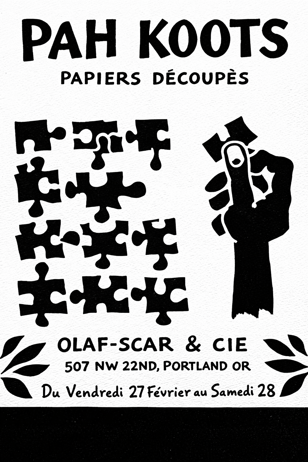
Black and White Matisse Print
This is an example of what I am interested in. The centered cut-out and the anonymous designers hand.
I feel like there’s something here worth pushing further. It’s a direction I’d like to come back to. I keep thinking about how this poster language could be extended through a physical printmaking process, something like the pulp paper technique used by Chuck Close.
Obviously, I’m not wanting to copy the above exactly. This is still too close. Something I’m thinking about.