Etudes Et Essais #1
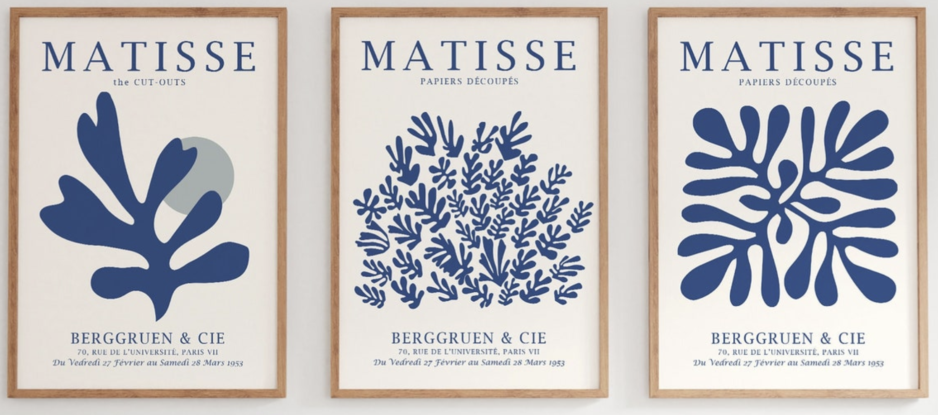
In a recent post on this blog, I wrote about Matisse and my interest in the intersection between his cut-outs and the nameless designers who produced posters that ended up combining brand, art, and graphic design.
Writing that post clarified a direction that is now becoming what I expect will be a large series.
I want to combine picture making (composition, color, mark-making), conceptual thinking (the philosophies behind the work and the object as commodity), and design (both visual and brand).
Showing where it was when I first thought this might be done vs end point.
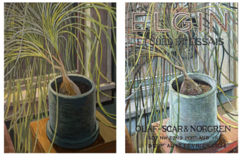
With Études et Essais, I began with what I initially considered a finished piece, my first egg tempera attempt, a plant study. I wasn’t fully satisfied with where it was, but I could see how it might improve and how it could benefit from this new design framework I was developing. The painting required substantial reworking to reach its current state. I chose small egg tempera panels assuming they would allow faster production than my drawings. That assumption proved incorrect.
Picture Making
This is simply a study looking out my window. I’m satisfied with the composition, and it represents one of my first completed egg tempera paintings. I like to observe and make changes as I work.
So much time went into mark making and color investigation. I don’t have the best camera so its hard to see the quality of the color or the transparency of the medium. I felt like a piano tuner. I think my approach here was to pull every square inch of the piece into tune, and that end effect of the painting is a musical chord.
Design
I’m interested in how layers of meaning are established by the Berggruen Gallery posters representing Matisse. The layered rows of information carry meaning, and I want to continue exploring how that hierarchy operates over time.
Concept/Brand
I like the directness of ELGIN. As with many commercial products today, the brand often becomes more important than the object itself.
Concept/Commodity
At present I do not have gallery representation, so Olaf-Scar & Norgren is fictionalized. Eventually this may function as an advertising layer within the work itself (anticipating the possibility of swapping galleries or even selling that space commercially).
I’m interested in how these works might operate as objects of value. I like the idea of these egg tempera paintings being the size they are and how they are in the tradition of reliquaries which have long had commercial properties of their own.
Conceptually, I’m satisfied with where the series is heading.
I don’t think this particular work reads strongly from a distance. The design elements do not assert themselves as clearly as intended. I’m still learning the medium and chose not to push experimentation too aggressively here. That said, I’m interested in allowing paint to pool and dry thickly on the panel. It sometimes crackles, producing compelling surface effects, though I remain unsure of the archival implications. I want to push this experimentation a lot further in future works. Much of the surface, however, is built through traditional egg tempera layering which are small, precise transparent brushstrokes on top of each other. In some spots I might have layered 80 or more times and this is causing some nice tactile effects.
Color decisions will continue to evolve. I’ve been working with raw pigments, and my palette currently rotates between twenty and thirty colors, each behaving differently. Learning their individual properties (how one pigment handles compared to another) has been something I’ve enjoyed.
For me, art is a conversation with artists of the past. I spend considerable time researching while working. When I look at this painting, I see it as a record of responding to painters I have admired.