
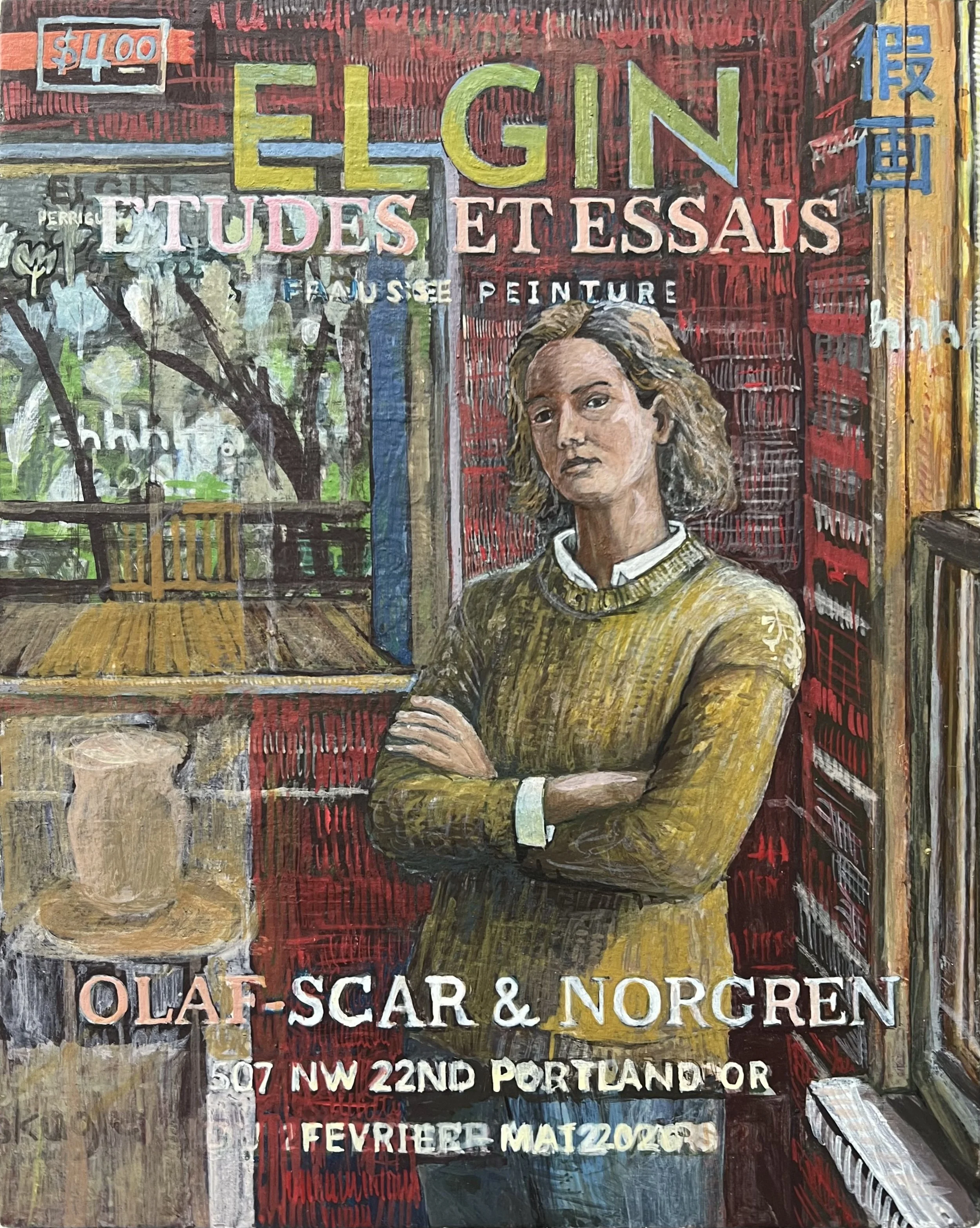
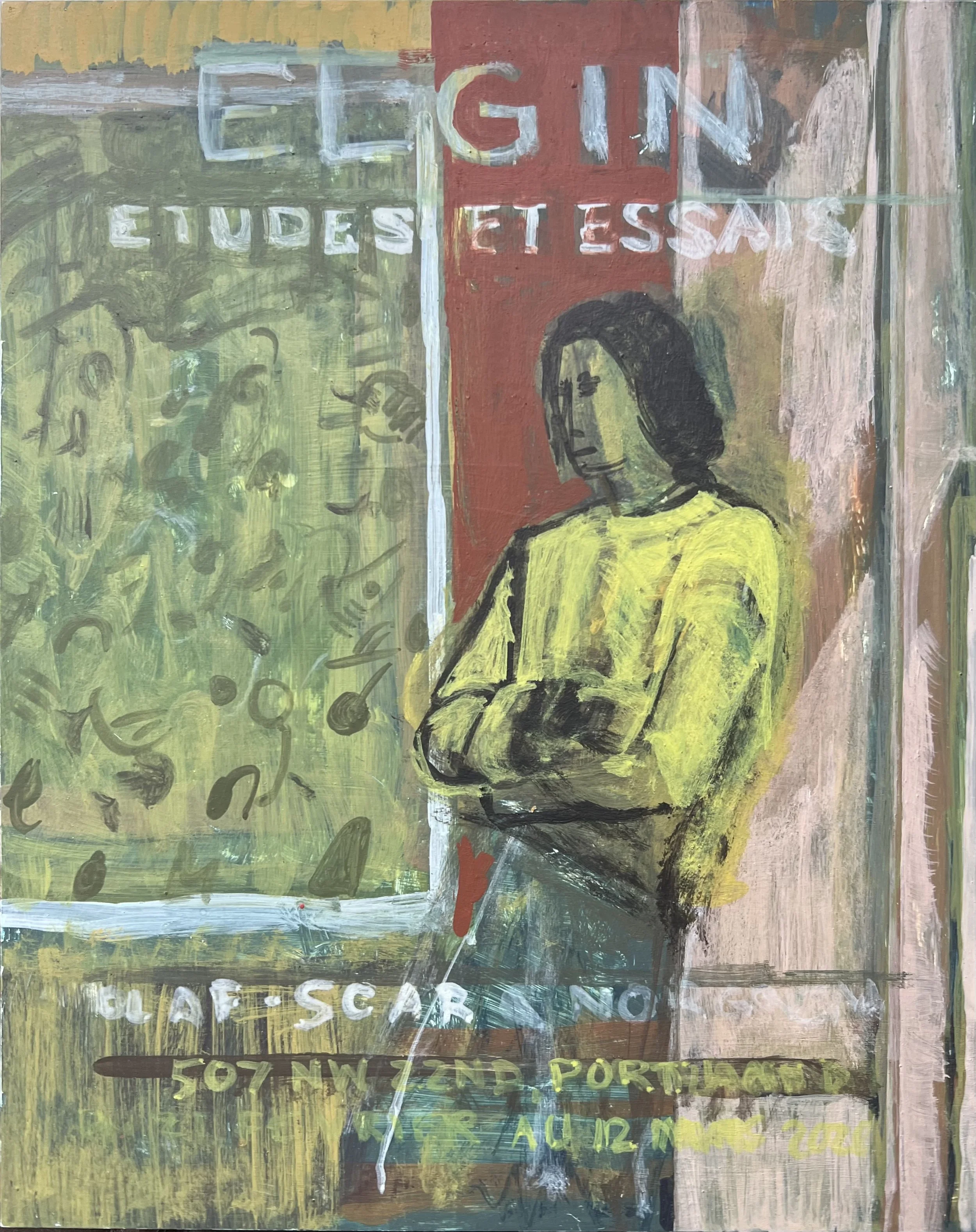
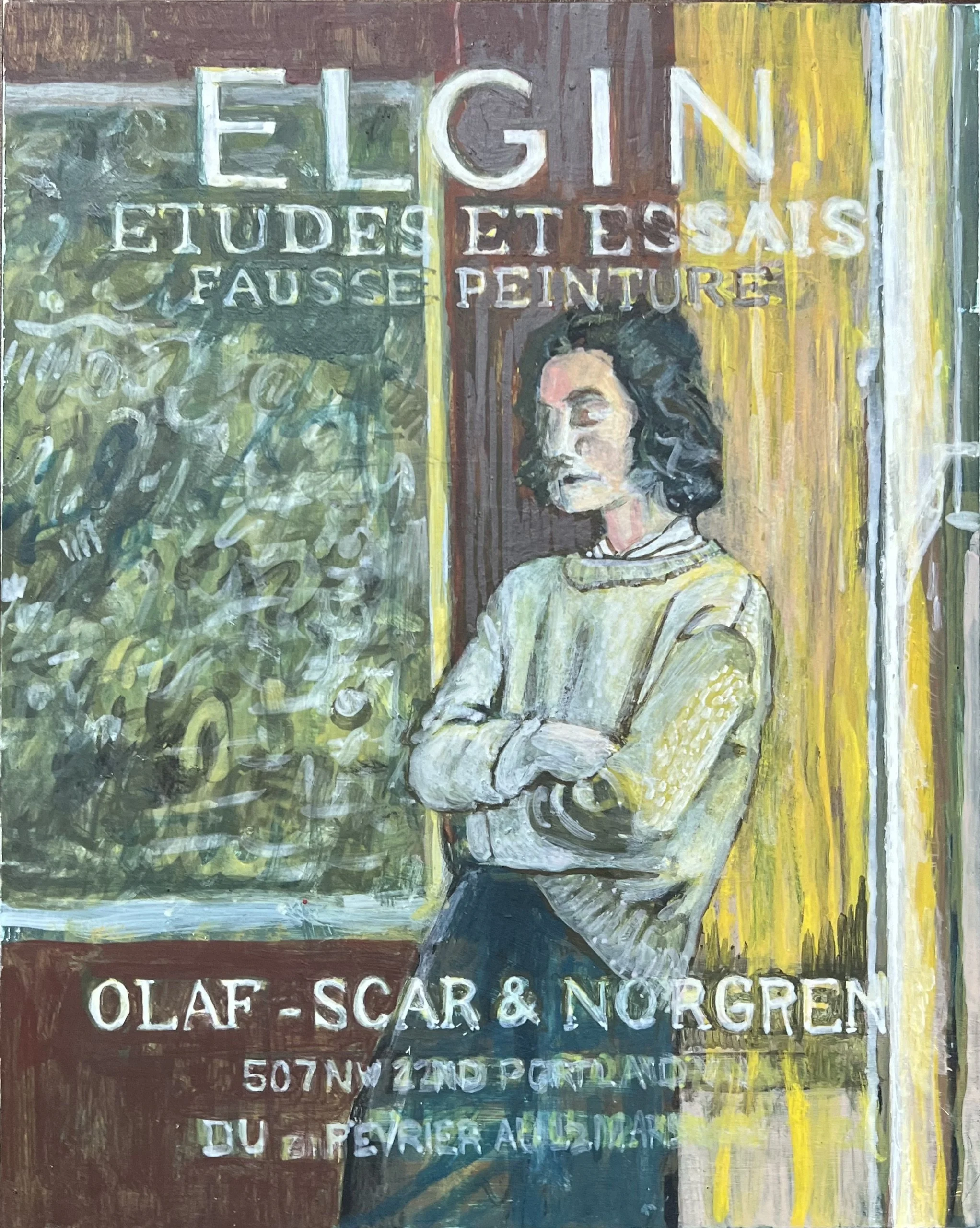
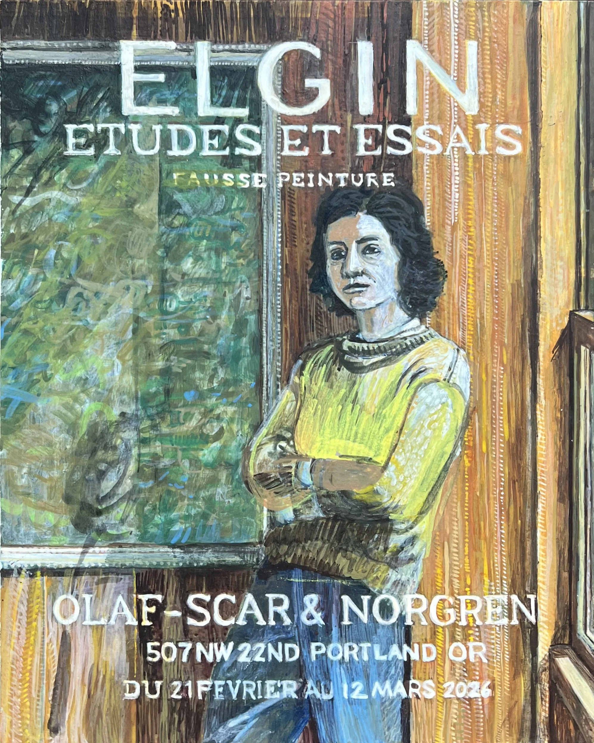
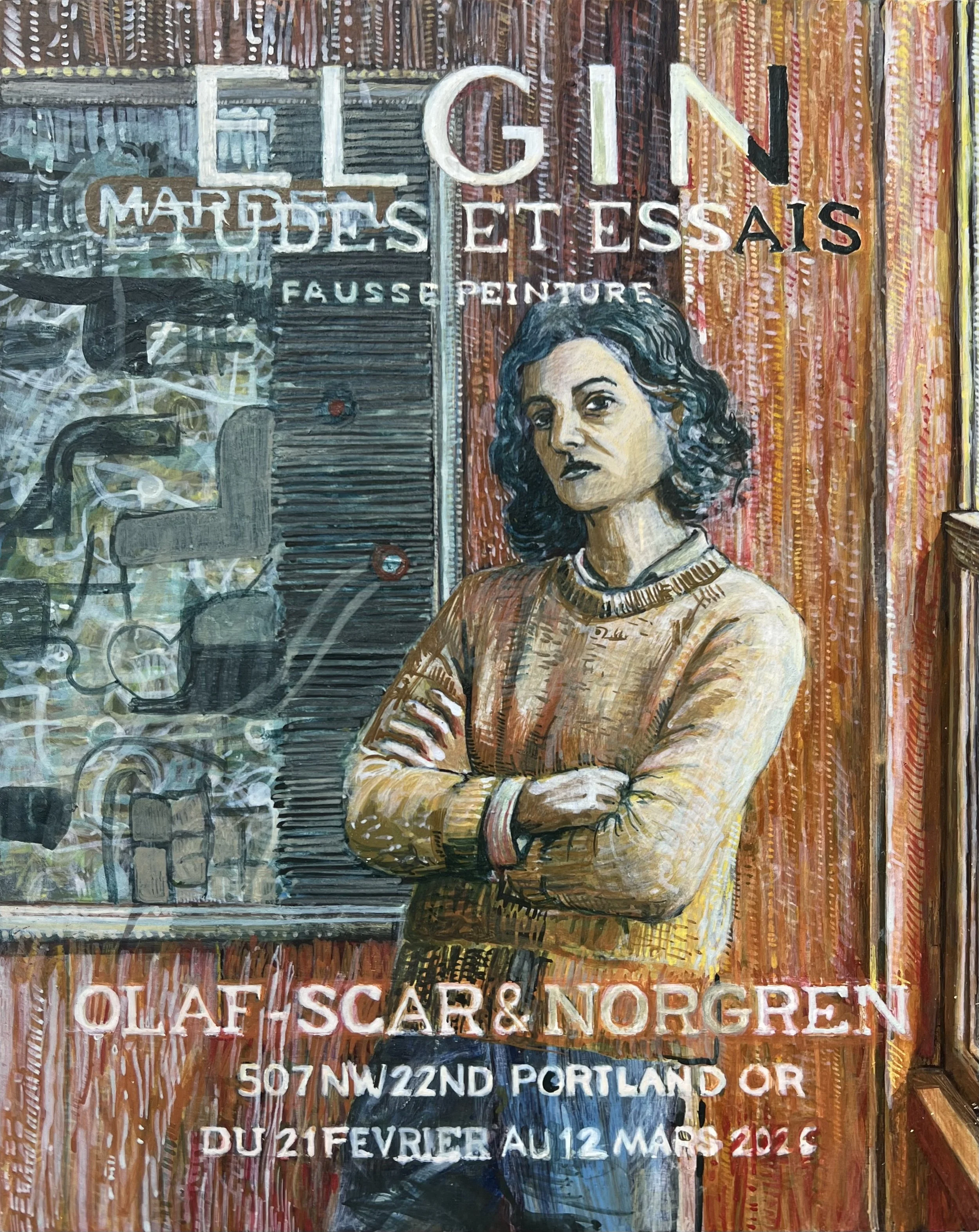
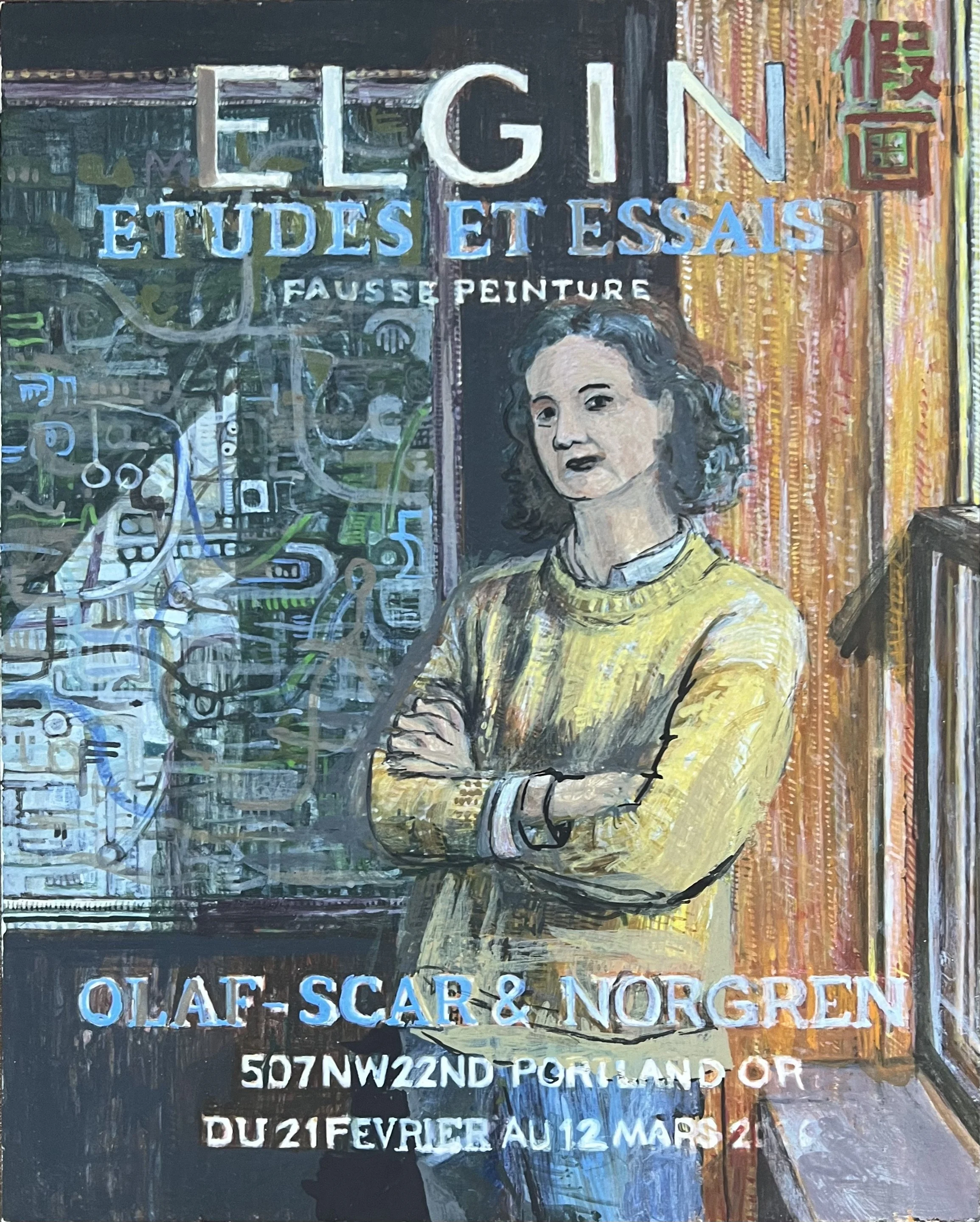
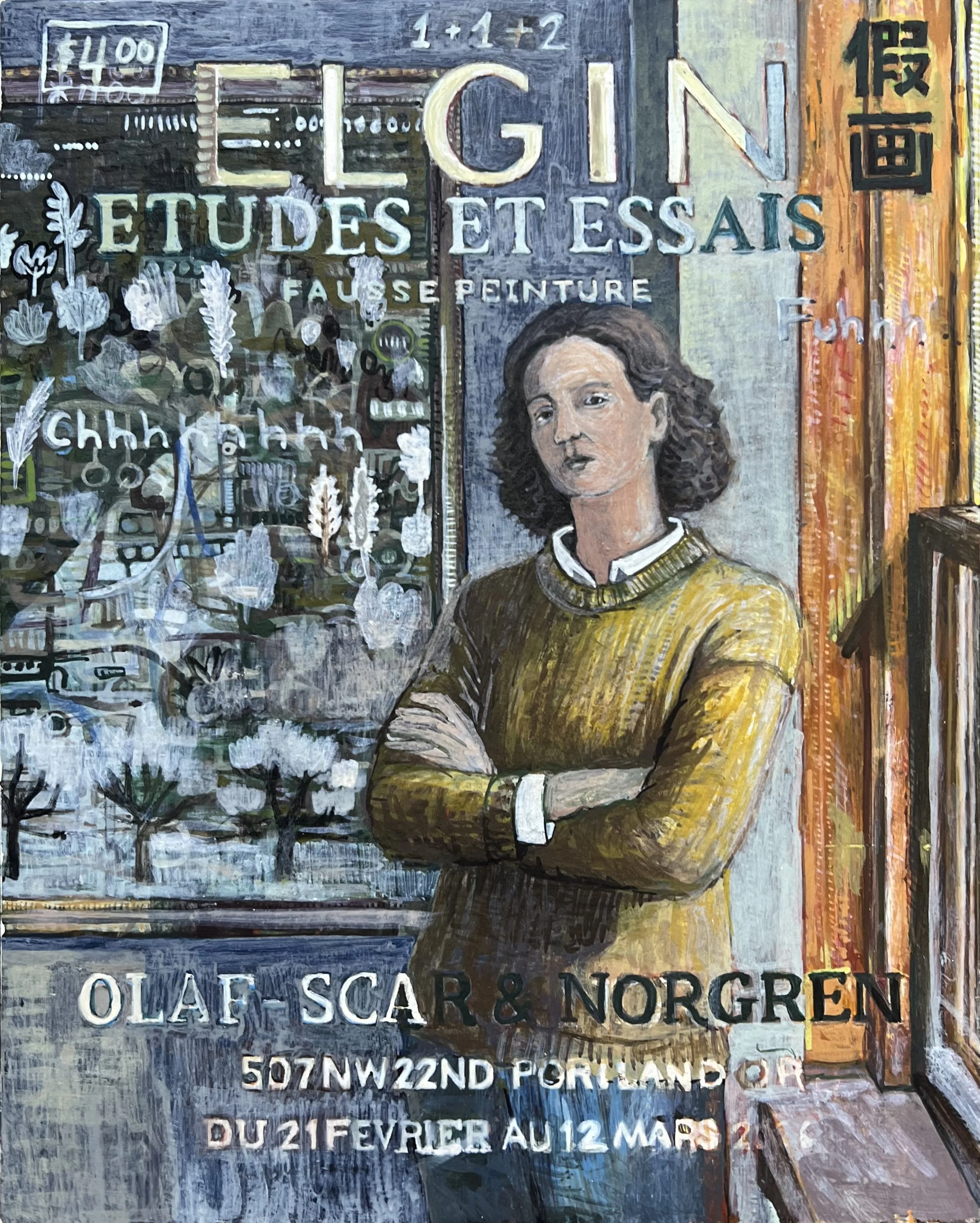
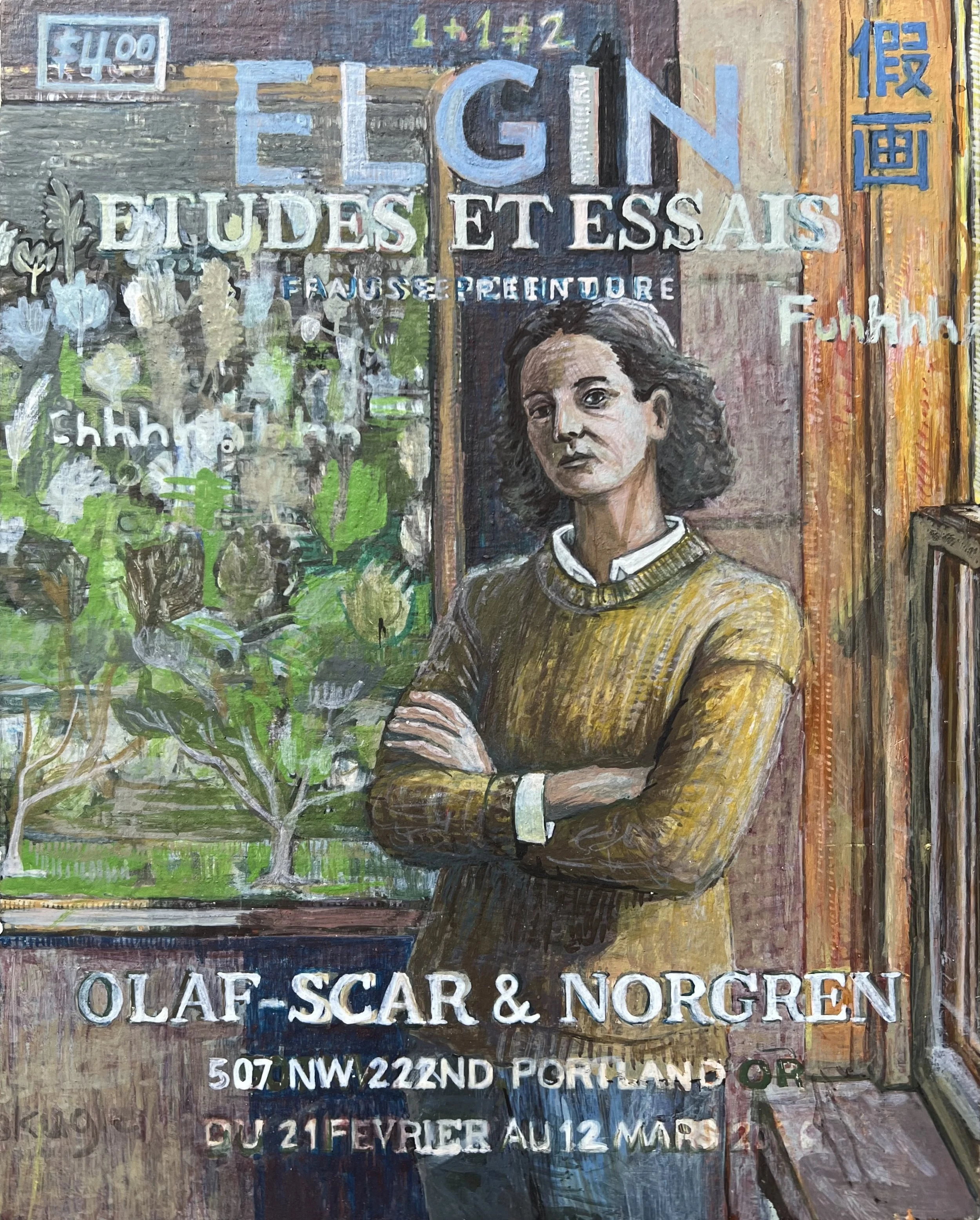
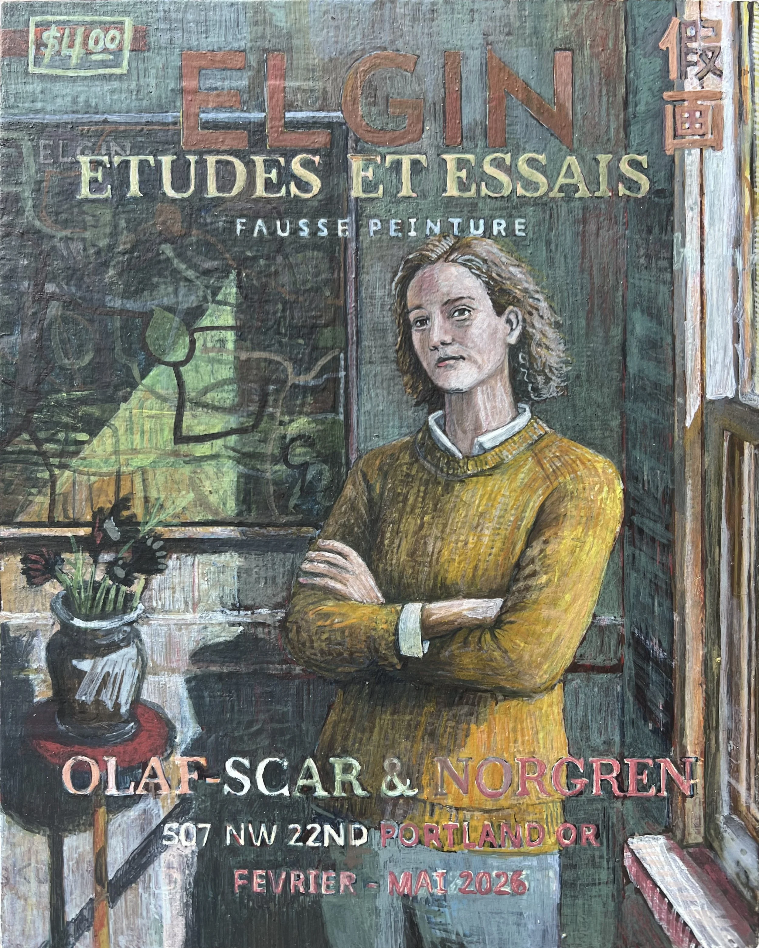
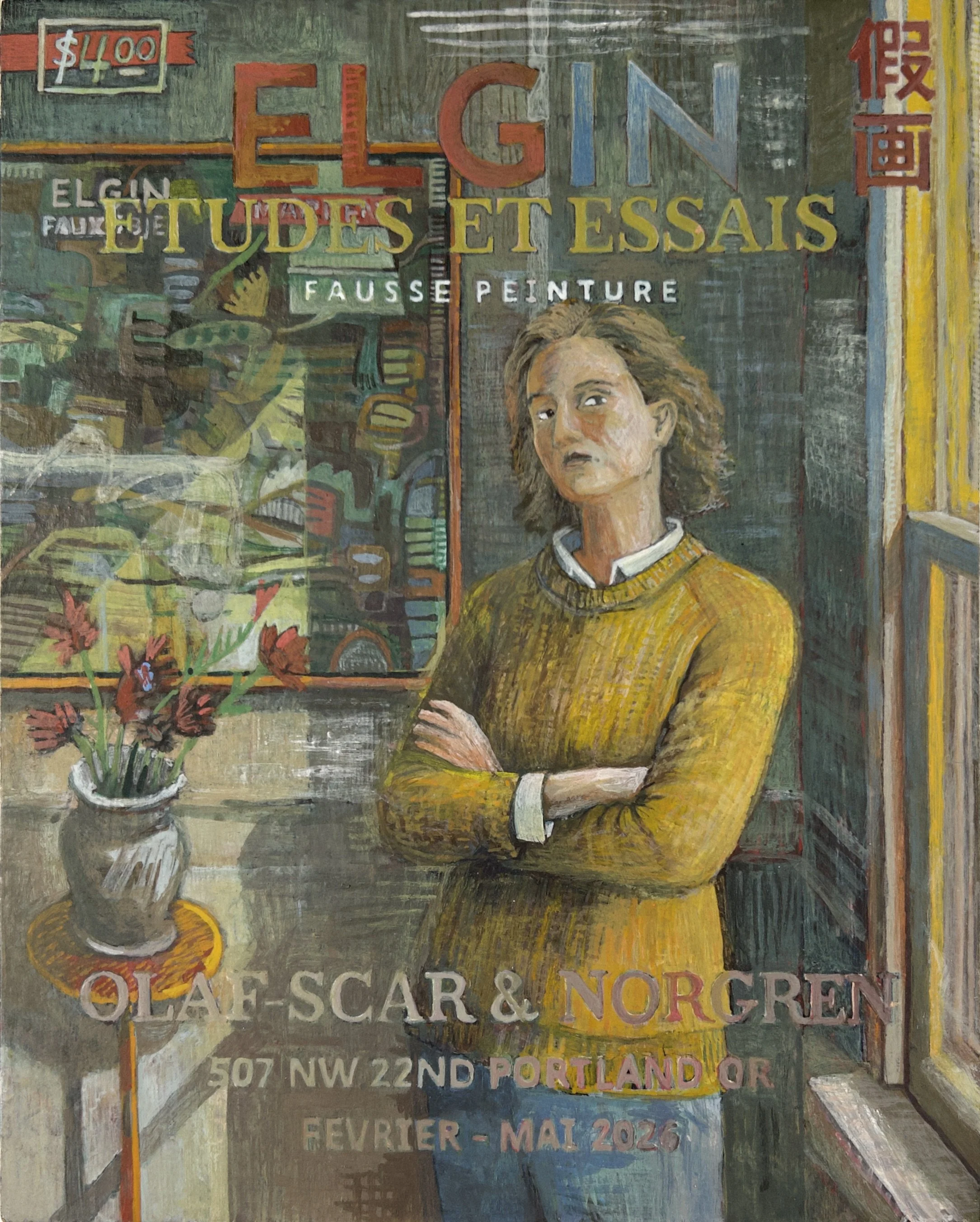
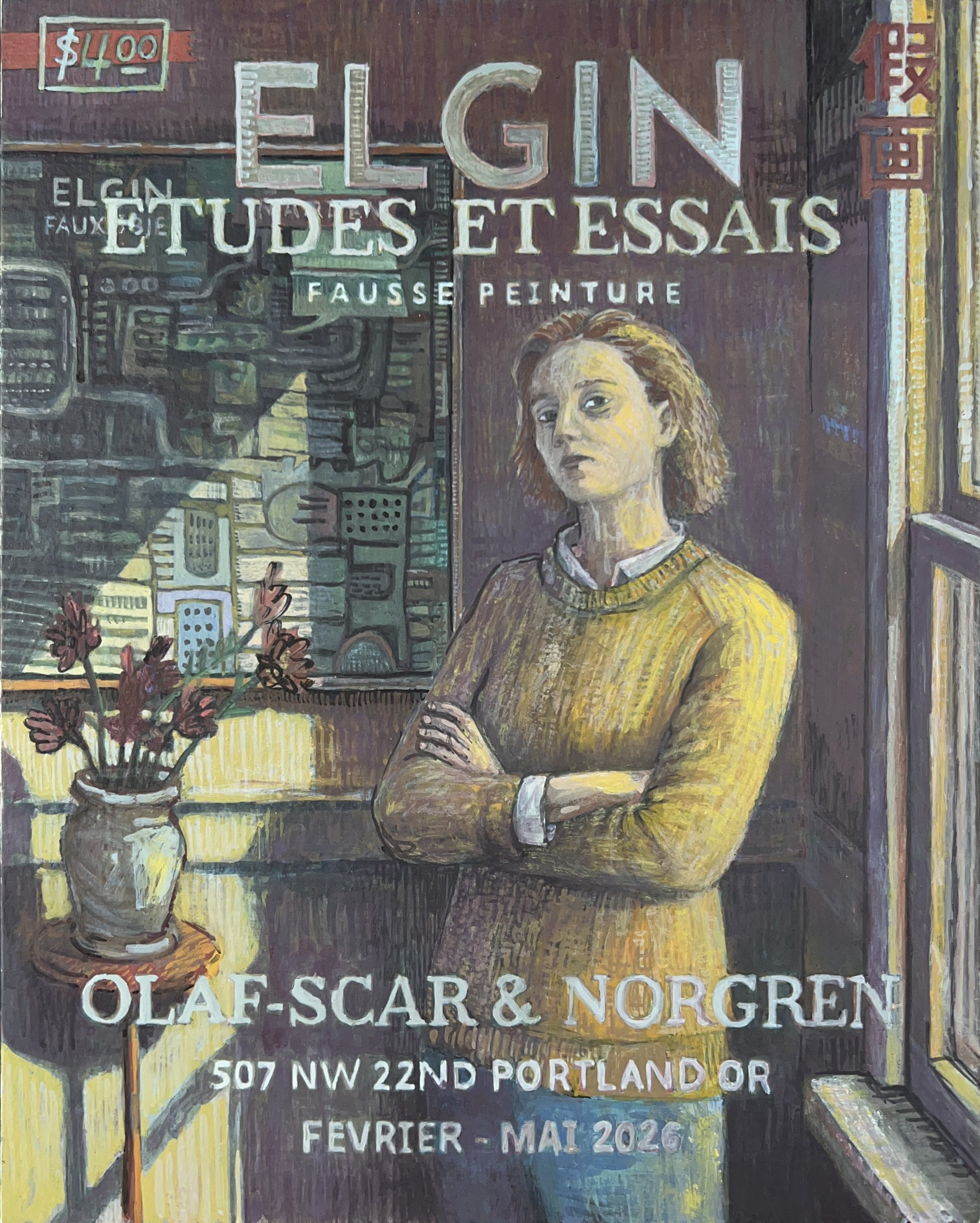
Etudes Et Essais #2, Fausse Peinture.
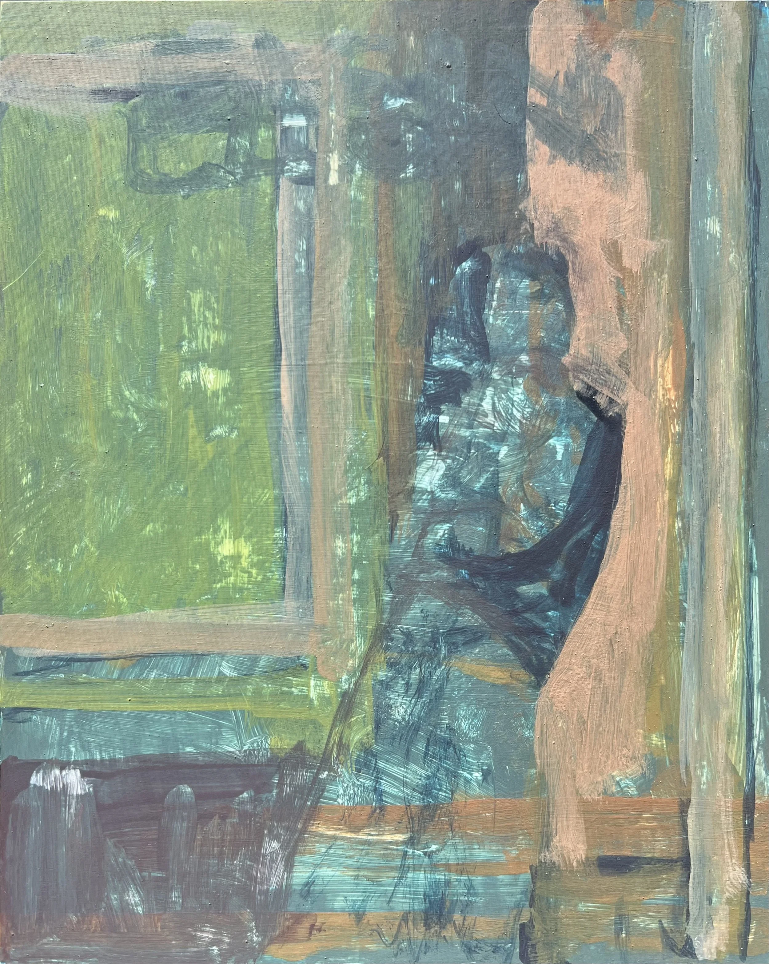
This work started as a small egg tempera study, mostly just a way to spend time with the medium and figure out how to manipulate color, value, and mark making.
Lately I’ve been starting a lot of paintings built around a figure inside a space with another artwork hanging somewhere in the composition. I like thinking about the relationship between the person and the painting.

At first, this painting was mostly about light, color, and texture. I found a photograph online and used it as a starting point.
I have this screenshot of a Twombly painting that I thought would look good in the background behind the lady.
I usually work on dozens of pieces at the same time, moving from one panel to another throughout the day. As I worked on this painting and several others, I started adding indexing systems and metadata.
ELGIN functions as a brand marker.
Études et Essais identifies the series.
假画 operates almost like a warning label or state advisory.
OLAF-SCAR & NORGREN is a fictional gallery.
The address acts as invented archival information tied to the work.
The date correlates to the start/end dates of the painting process.
I like the way this kind of language sits inside an image. Contemporary life is saturated with branding, metadata, labels, warnings, and interfaces.

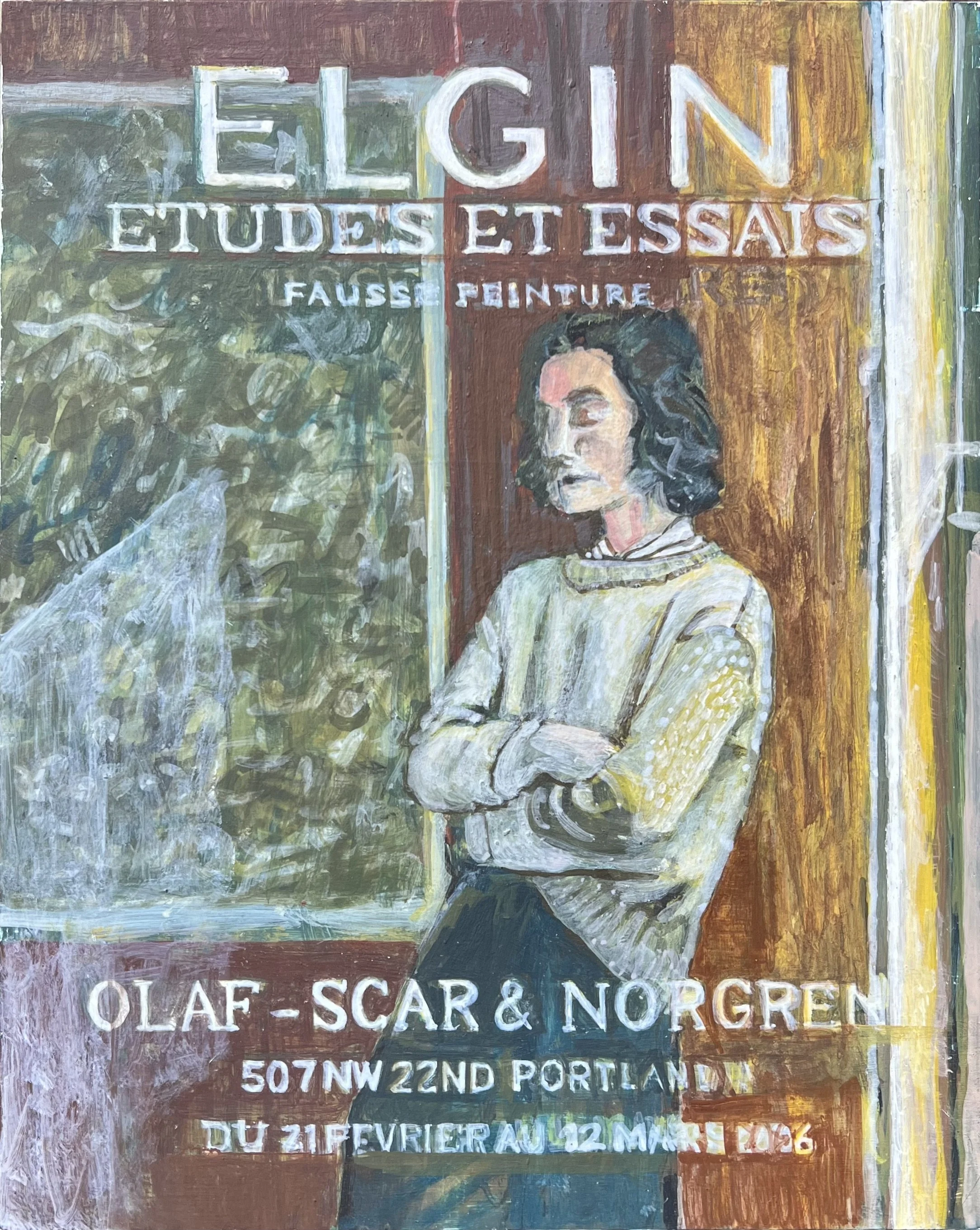
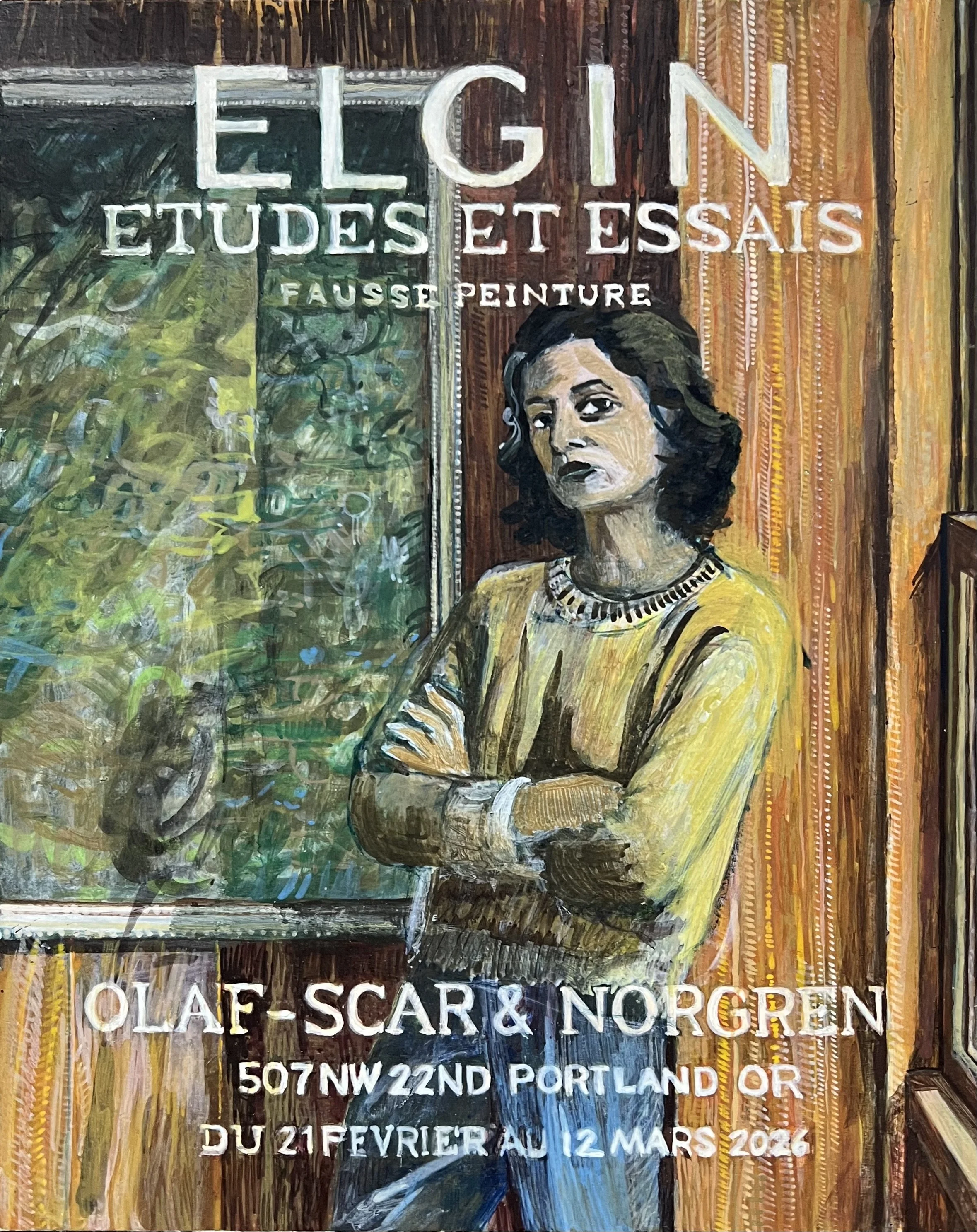
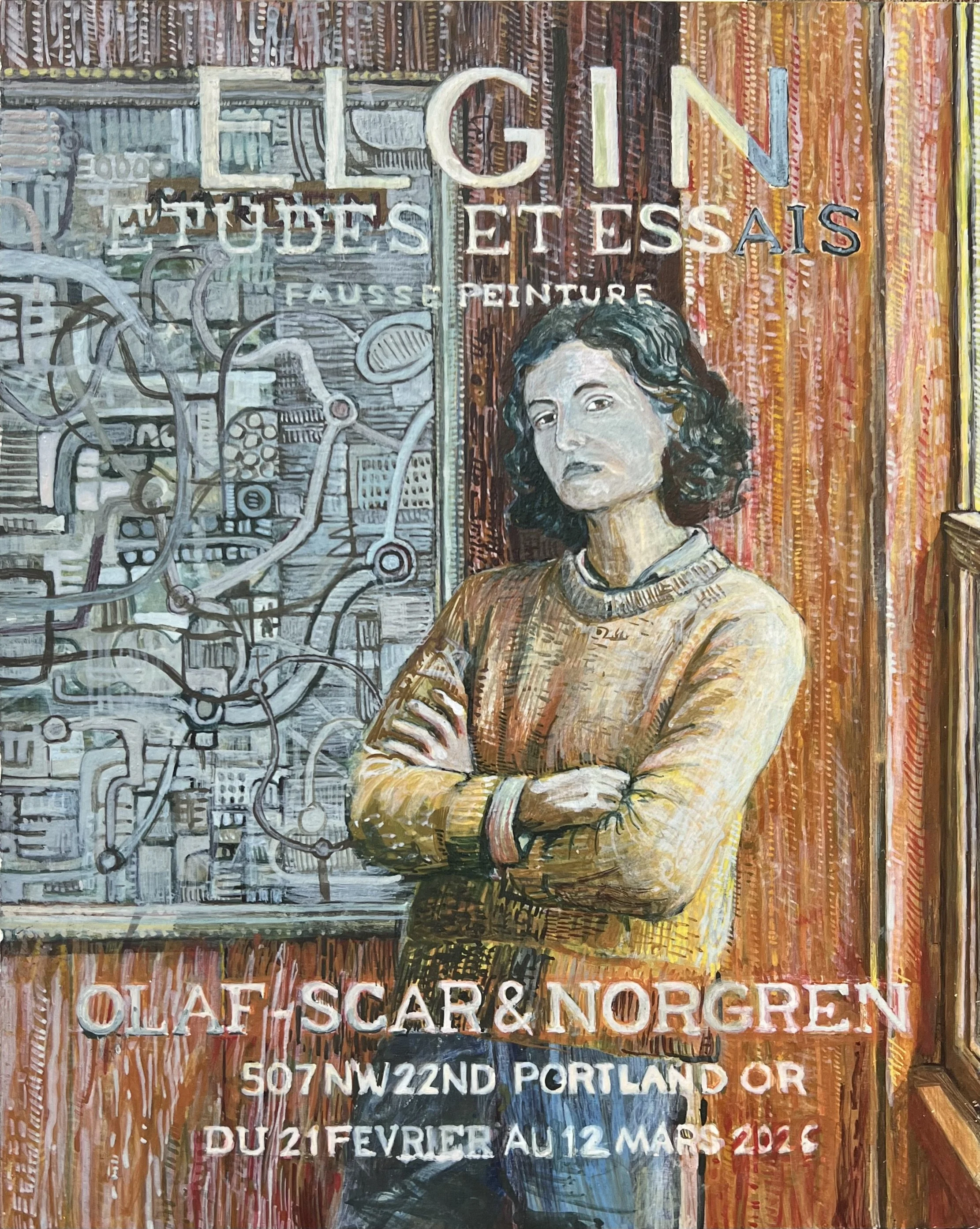
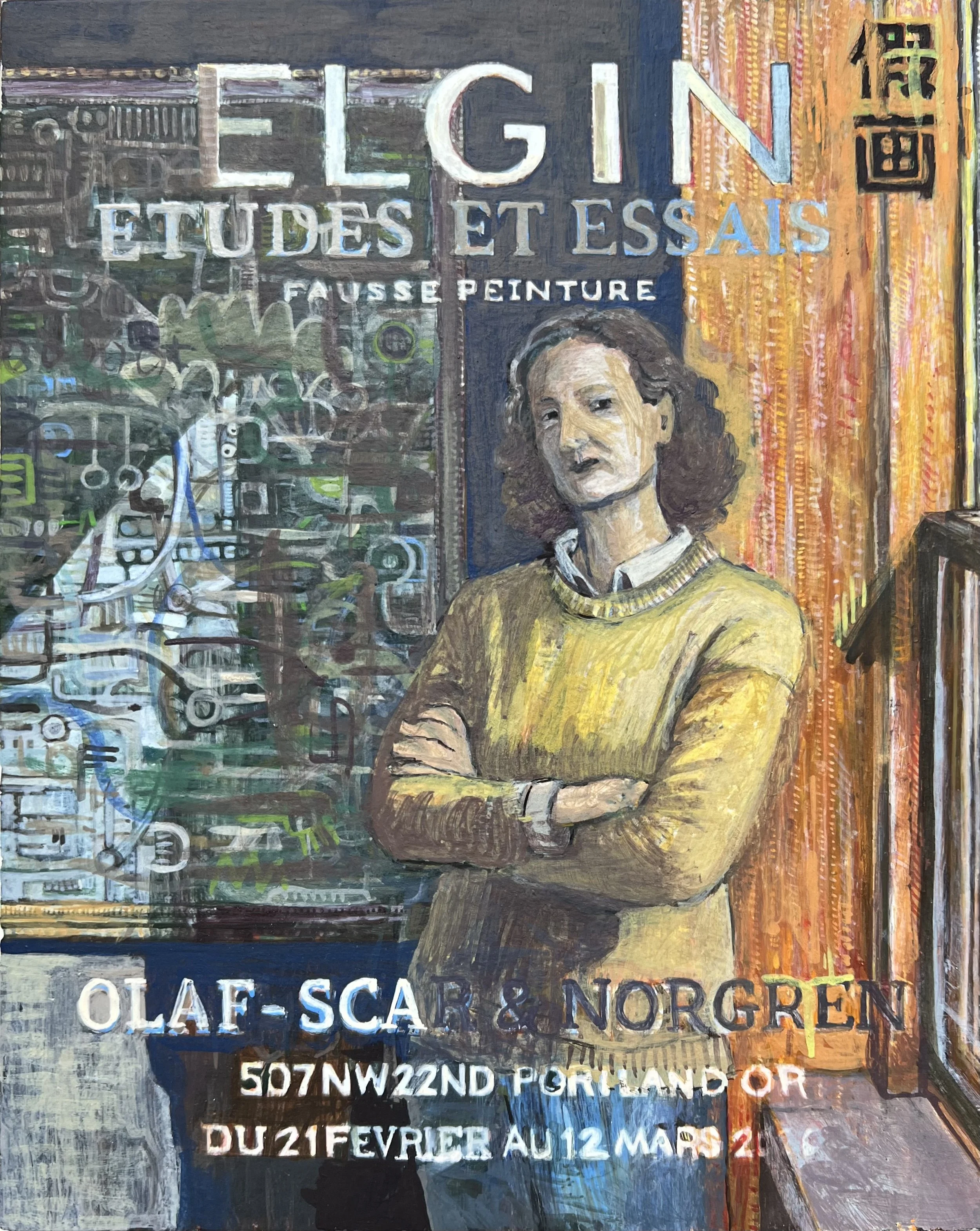
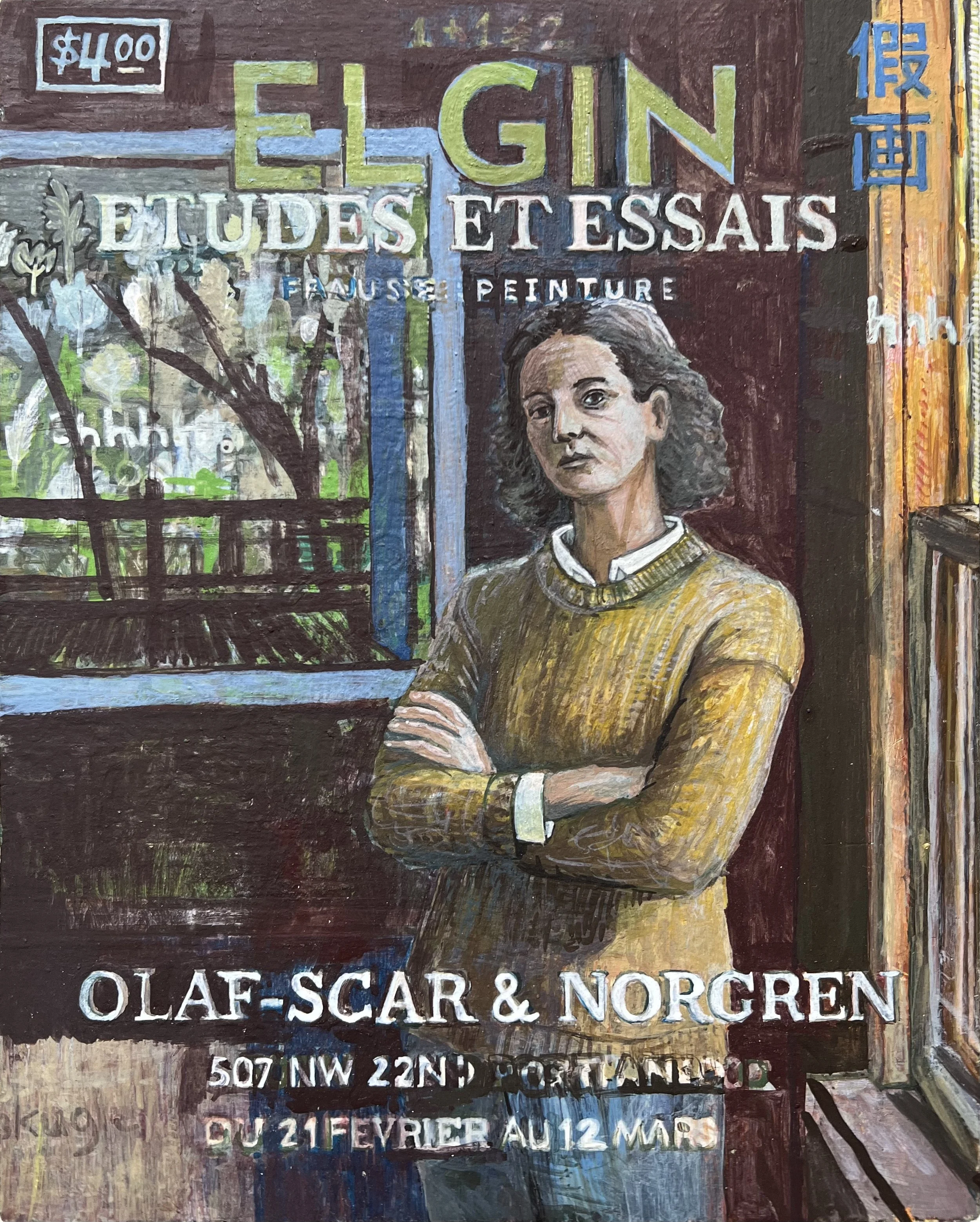
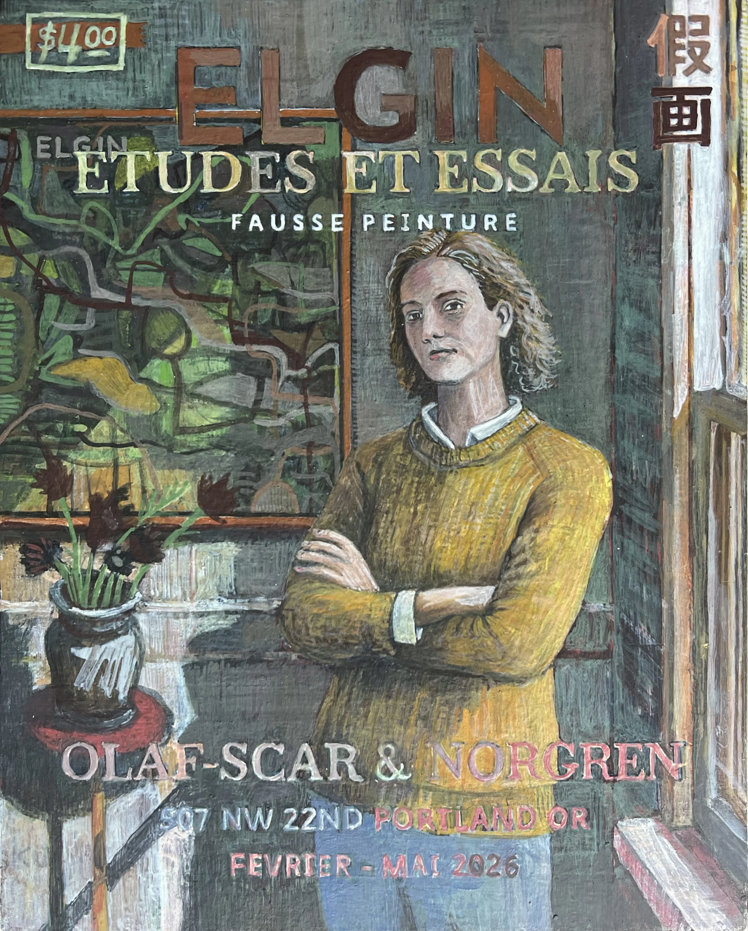
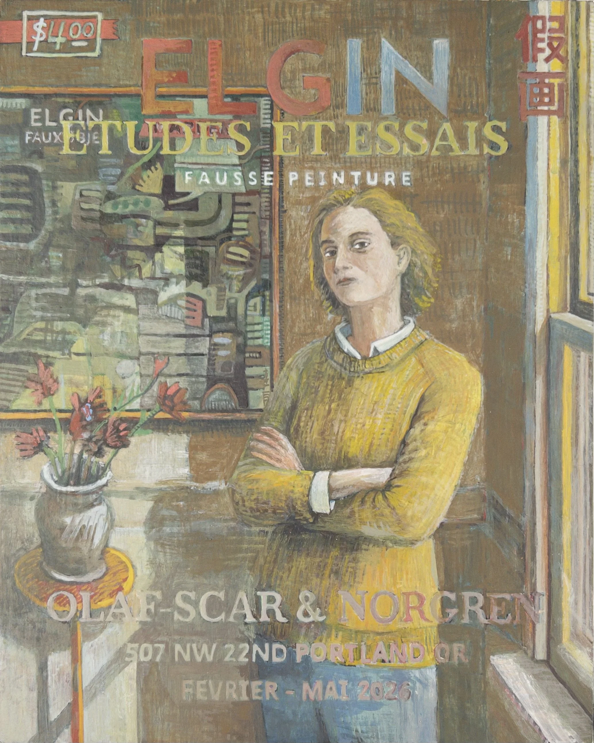
At another stage of the process I started experimenting with sunlight moving across an interior wall. Once that happened, it became important that the light actually interacted with the painting in the background.
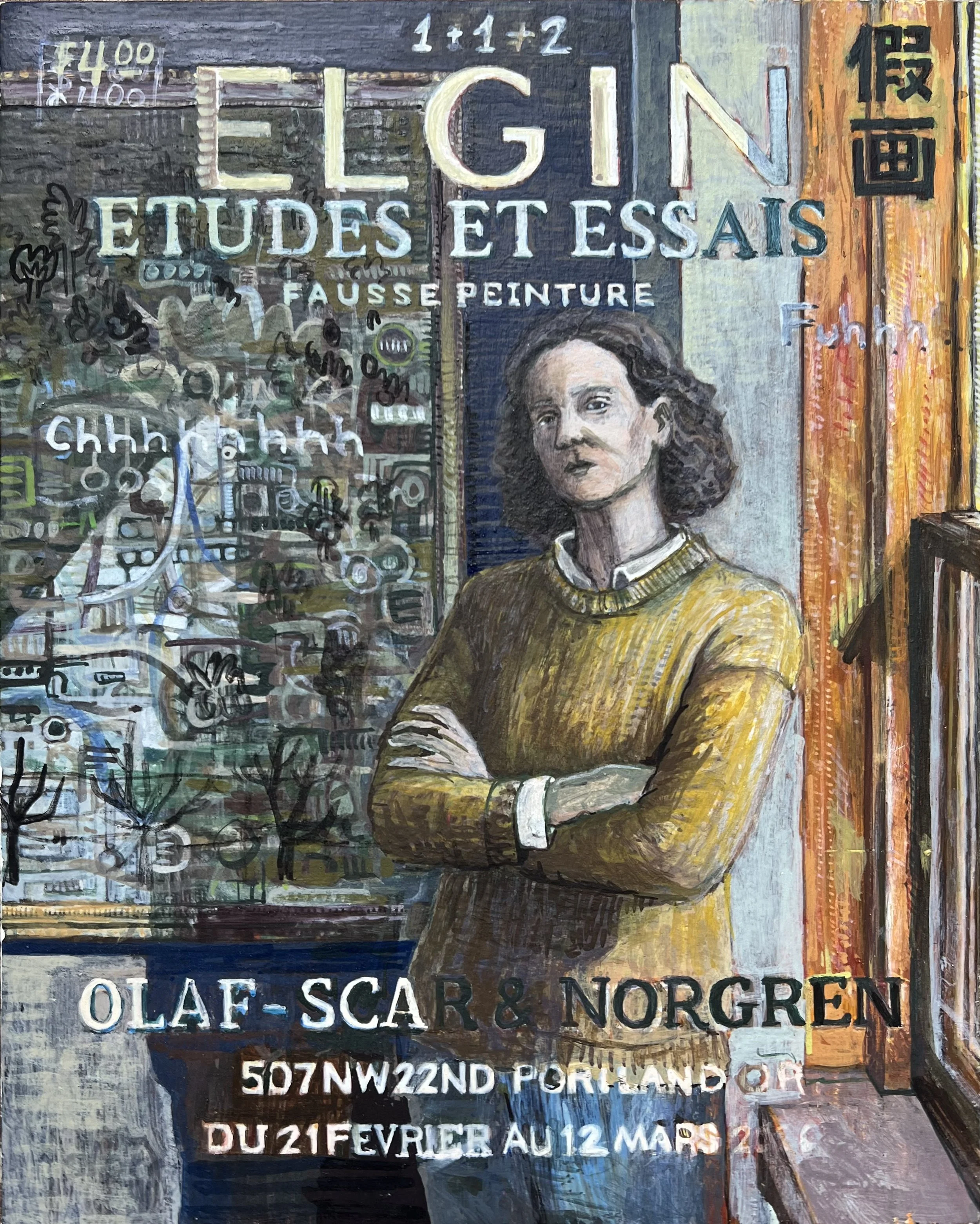
As the work developed, I had to move away from the source photograph much more aggressively. Years ago I spent a long time making photorealist paintings, and at this point I have no interest thinking in that mode again. The closer this piece stayed to the reference image, the more dead it felt.
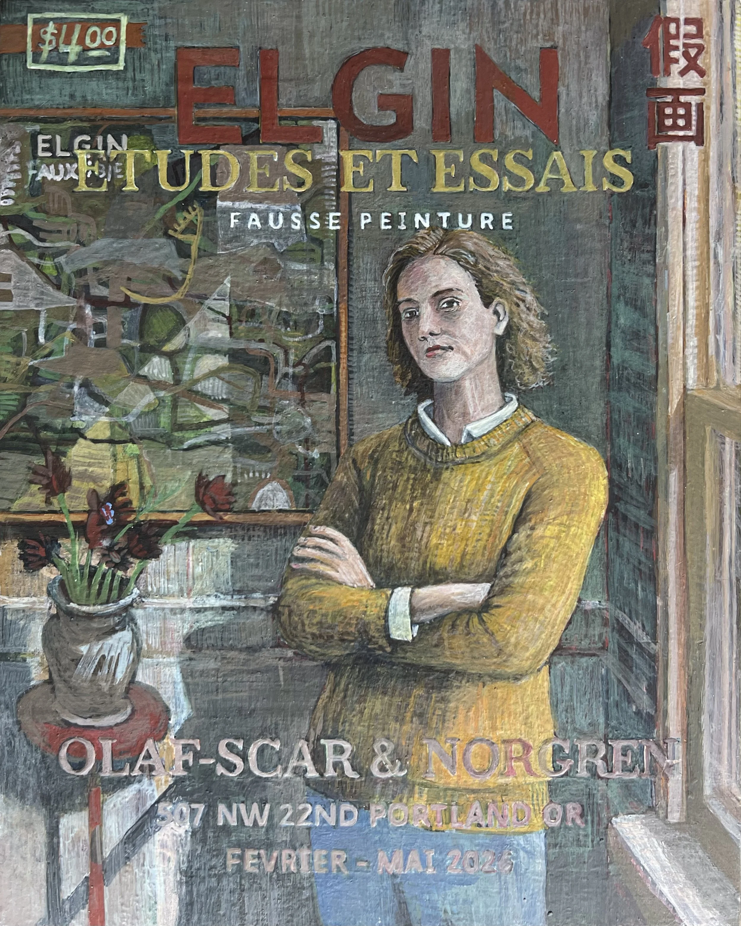
So I kept repainting the figure and the surrounding space over and over again, pushing away from the original photograph while also trying to move toward something I couldn’t fully define.

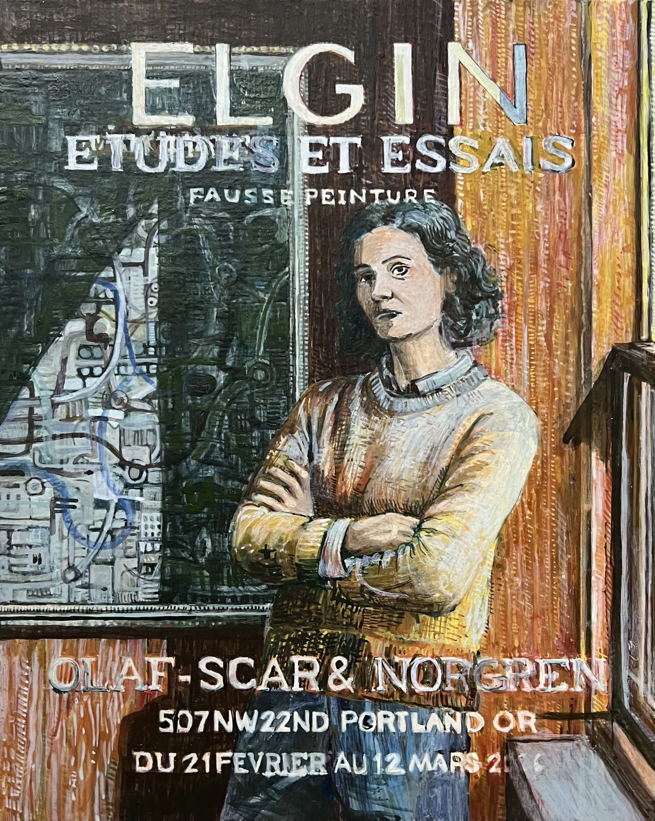
There were moments where the painting nearly settled into something resolved, and in retrospect I probably could have stopped earlier and refined what was already there. Instead I kept pushing it because I could still feel the original photograph underneath the surface.
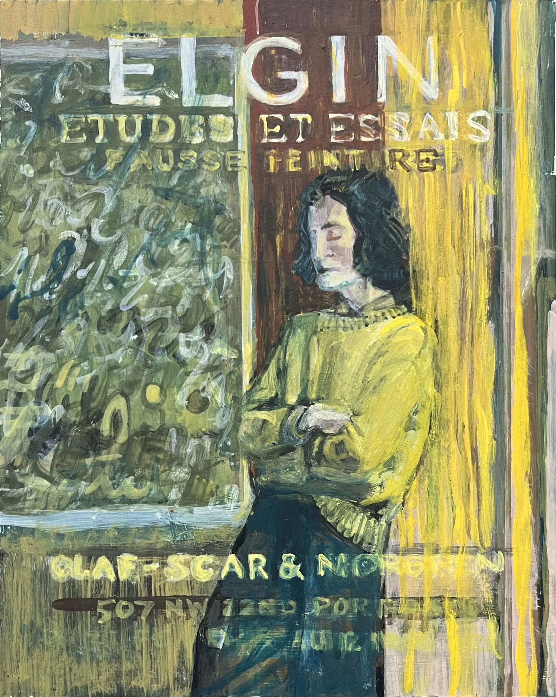
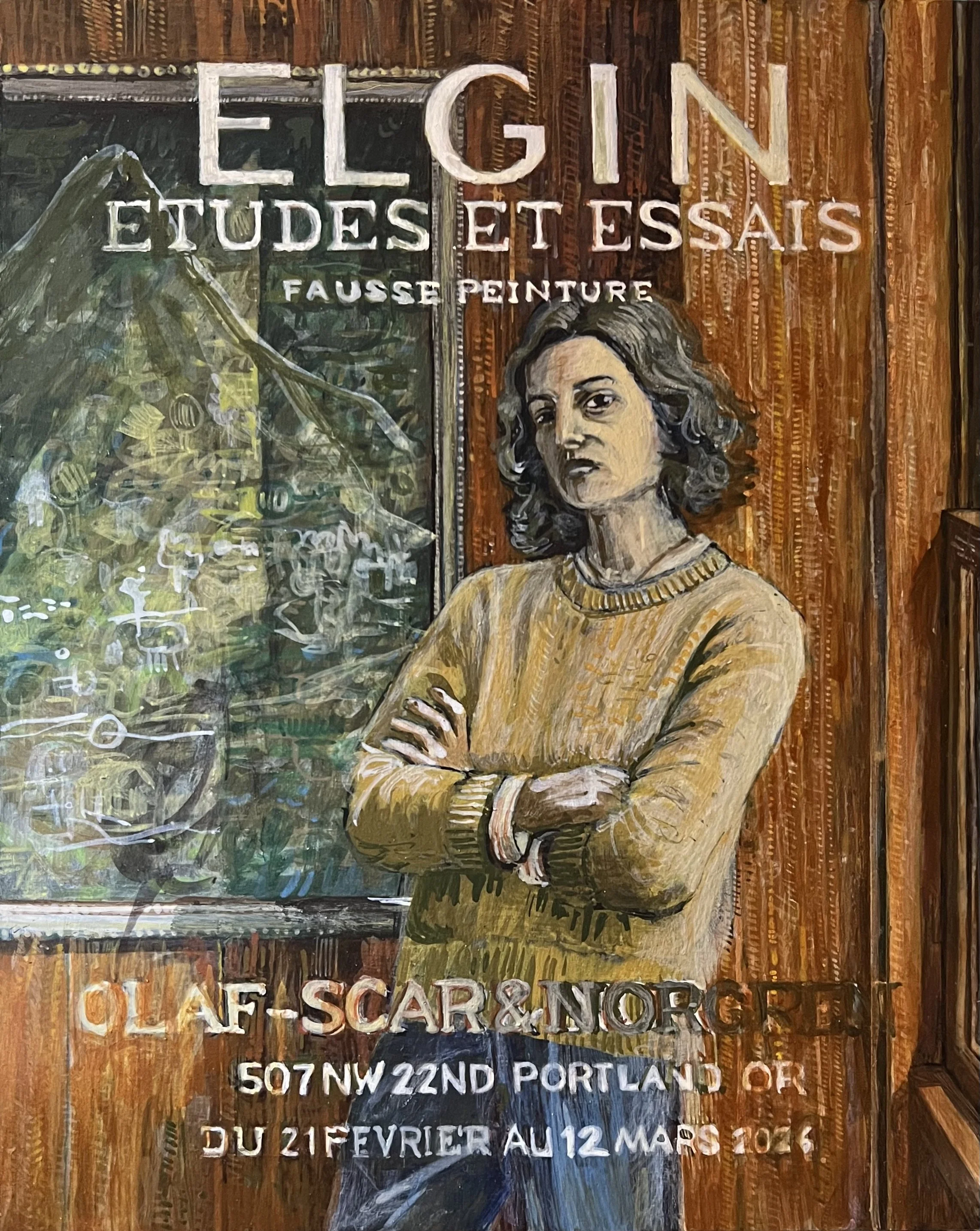
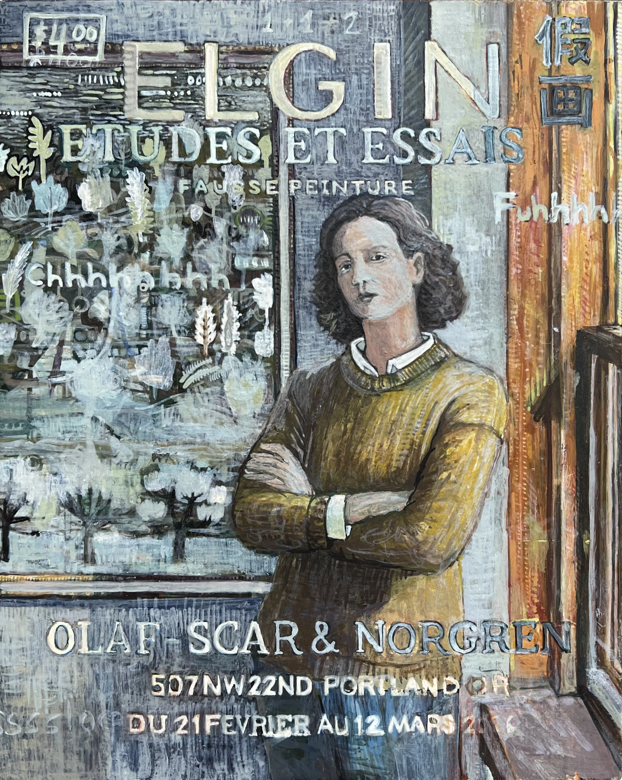
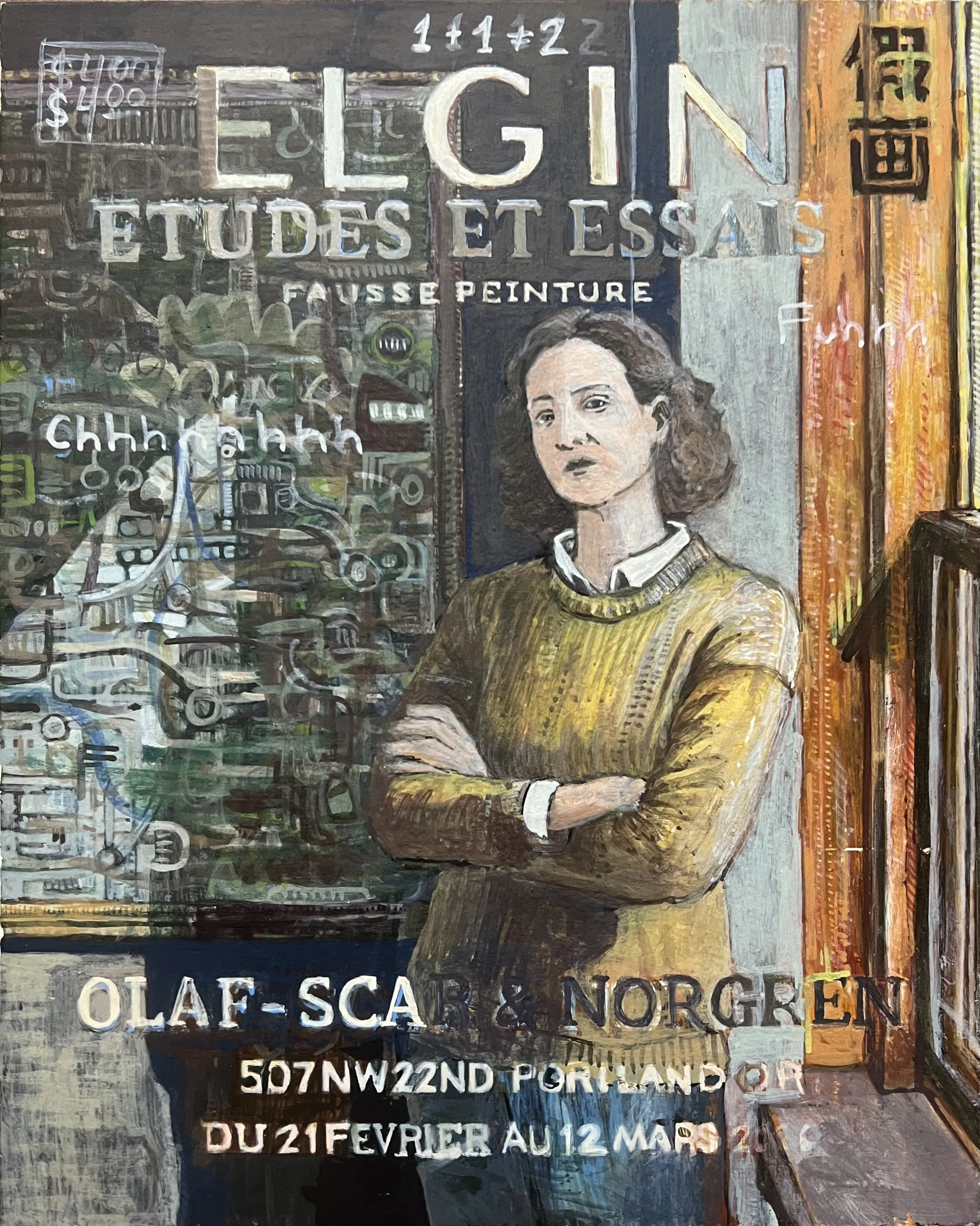
Eventually, once the composition settled down, the painting became less about the reference image and more about moving color and tonal relationships around the surface. I started paying attention to very small interactions: the edge between two colors, the direction of a brush mark, the way a letter in the foreground sat against the space behind it.
When a painting starts working, it can feel like fitting a puzzle piece into exactly the right place. I may still destroy it ten minutes later, but there are brief moments where the negative space, color, and mark making suddenly begin to lock together.
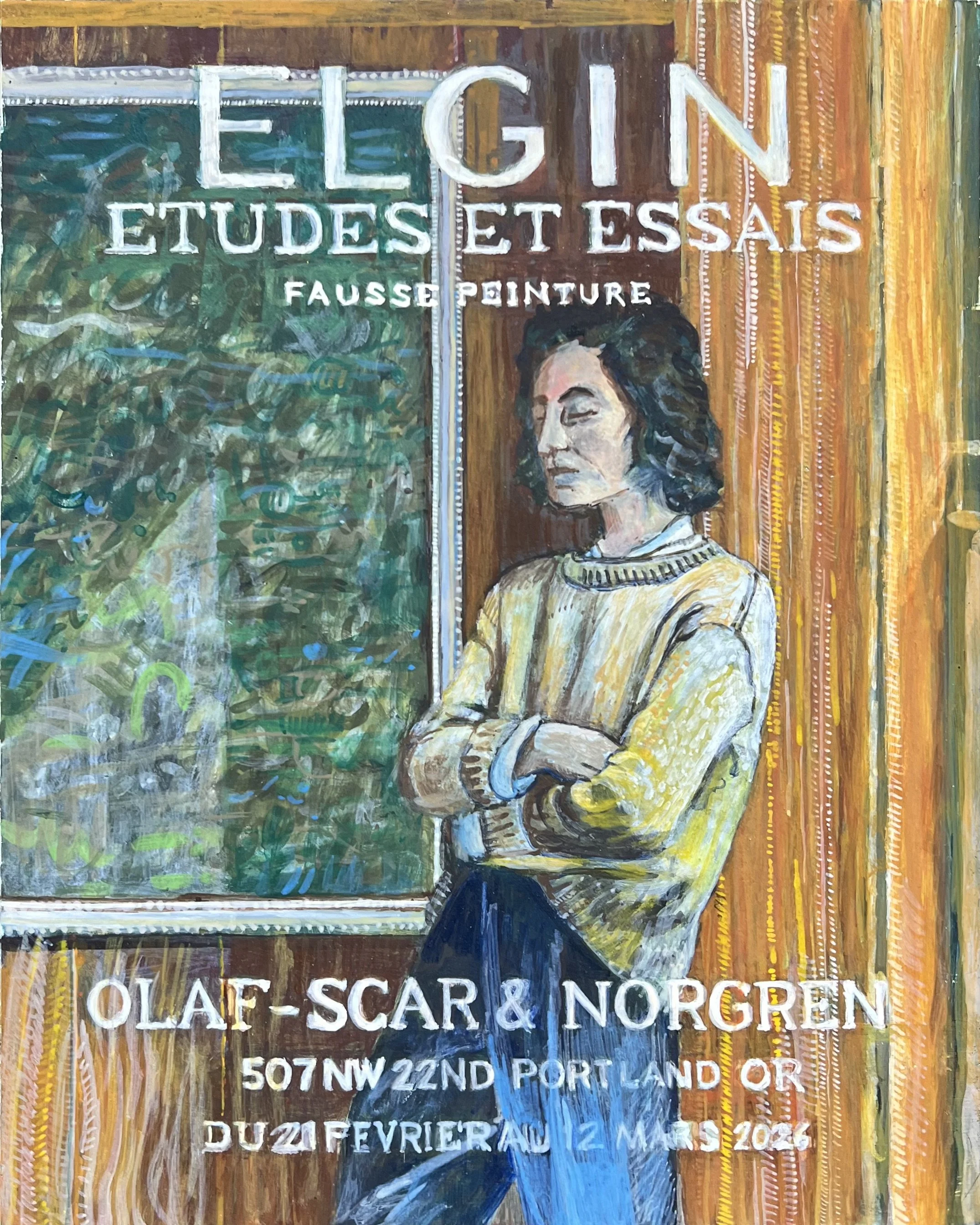
As the work moves closer to completion, those moments start happening more frequently.
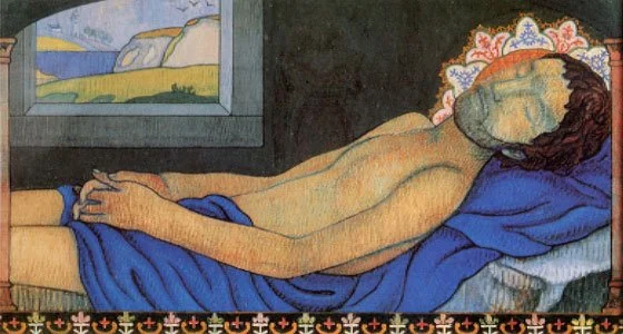
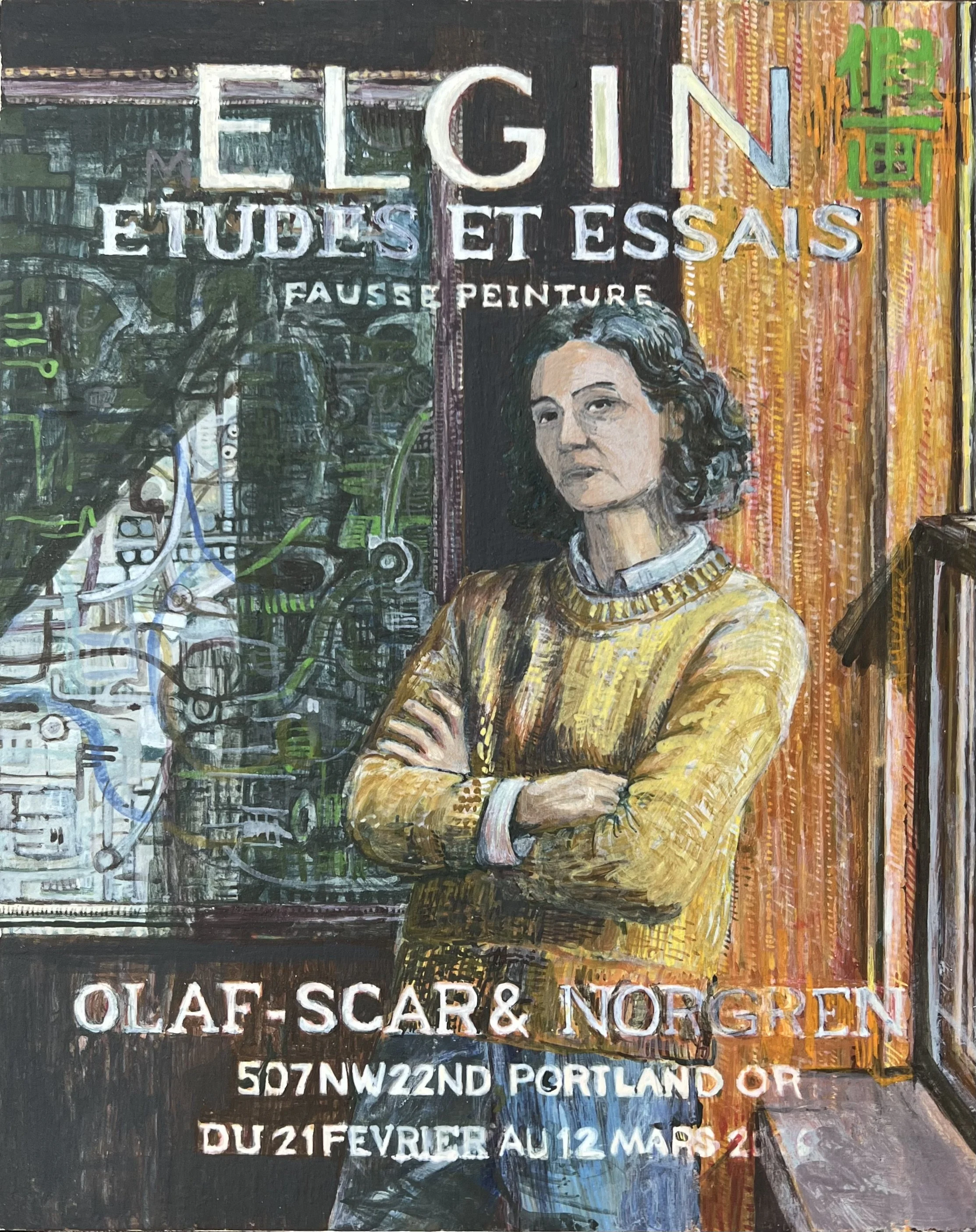
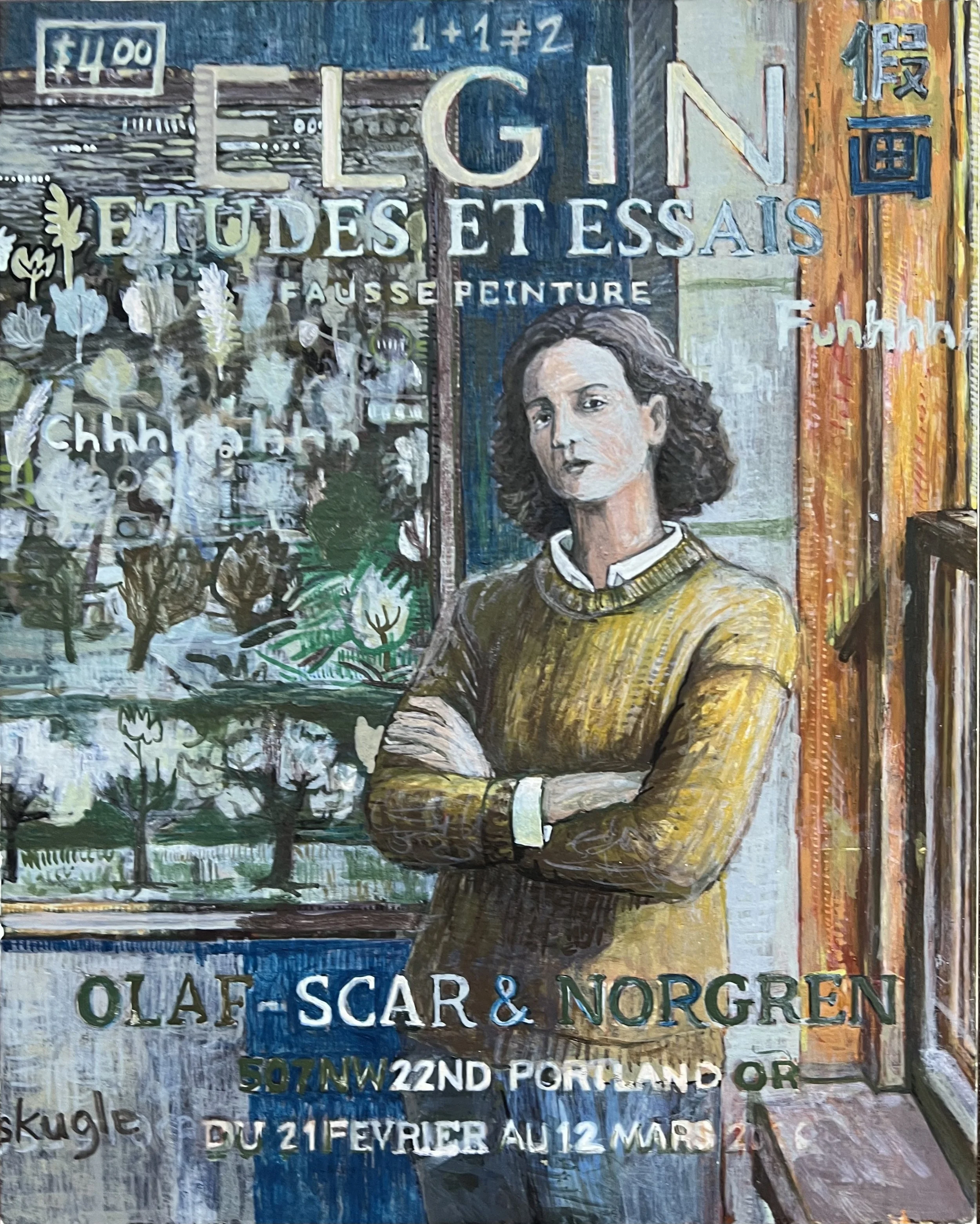
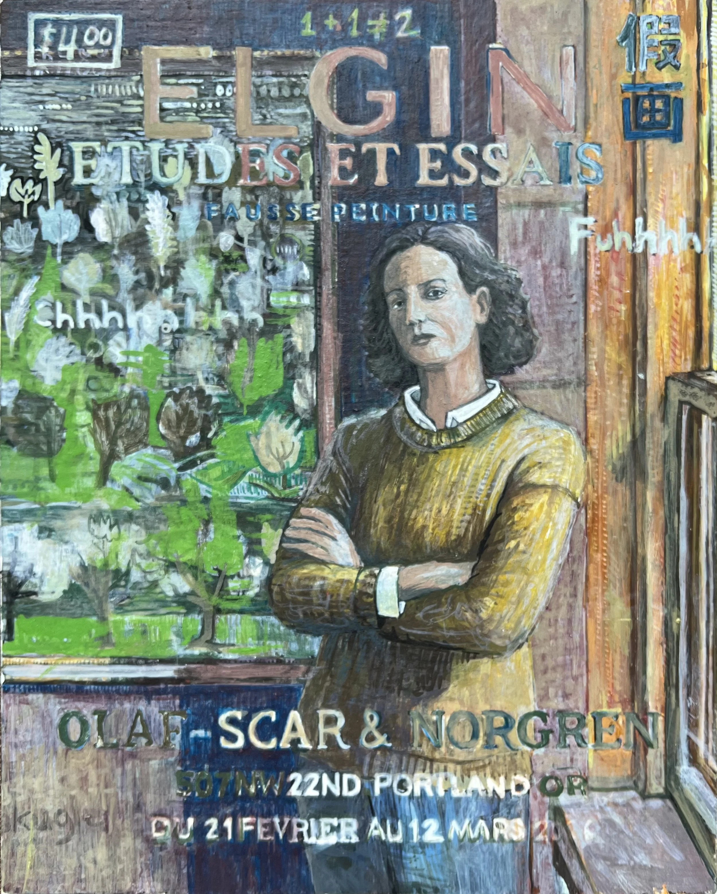
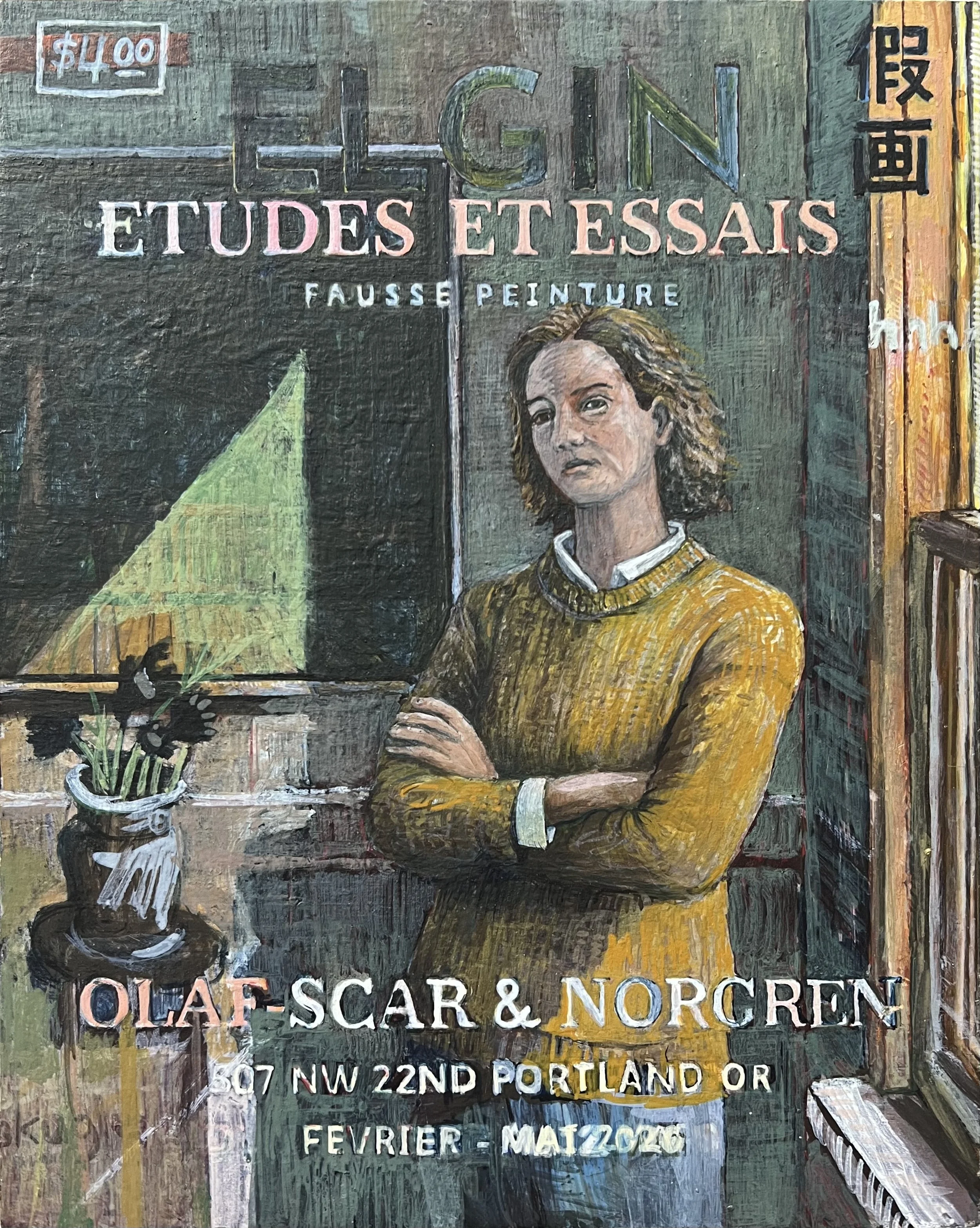
While struggling with the colors of the interior, I came across Charles Filiger’s The Recumbent Christ (1895) and knew I wanted to move in that direction. I was drawn to the interior emotional stillness the color evoked.
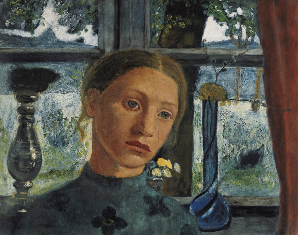
I also kept thinking about Paula Modersohn-Becker’s Girl’s Head in Front of a Window (1902). I appreciated the brushwork and color in this painting.
Part of painting is recognizing when an area has been overworked. I often become attached to passages that are functioning well, but the painting still requires me to destroy them in order to move the whole thing forward. Much of it becomes demolition and reconstruction.
What mattered to me here was discovery through the act of painting itself. I began with a photograph, but I didn’t want the final image to simply reproduce it.
The process can feel adversarial. I’m constantly fighting what I’ve already put down, especially when parts of it already feel resolved. The image may begin with something recognizable, but the actual work is in the rebuilding.
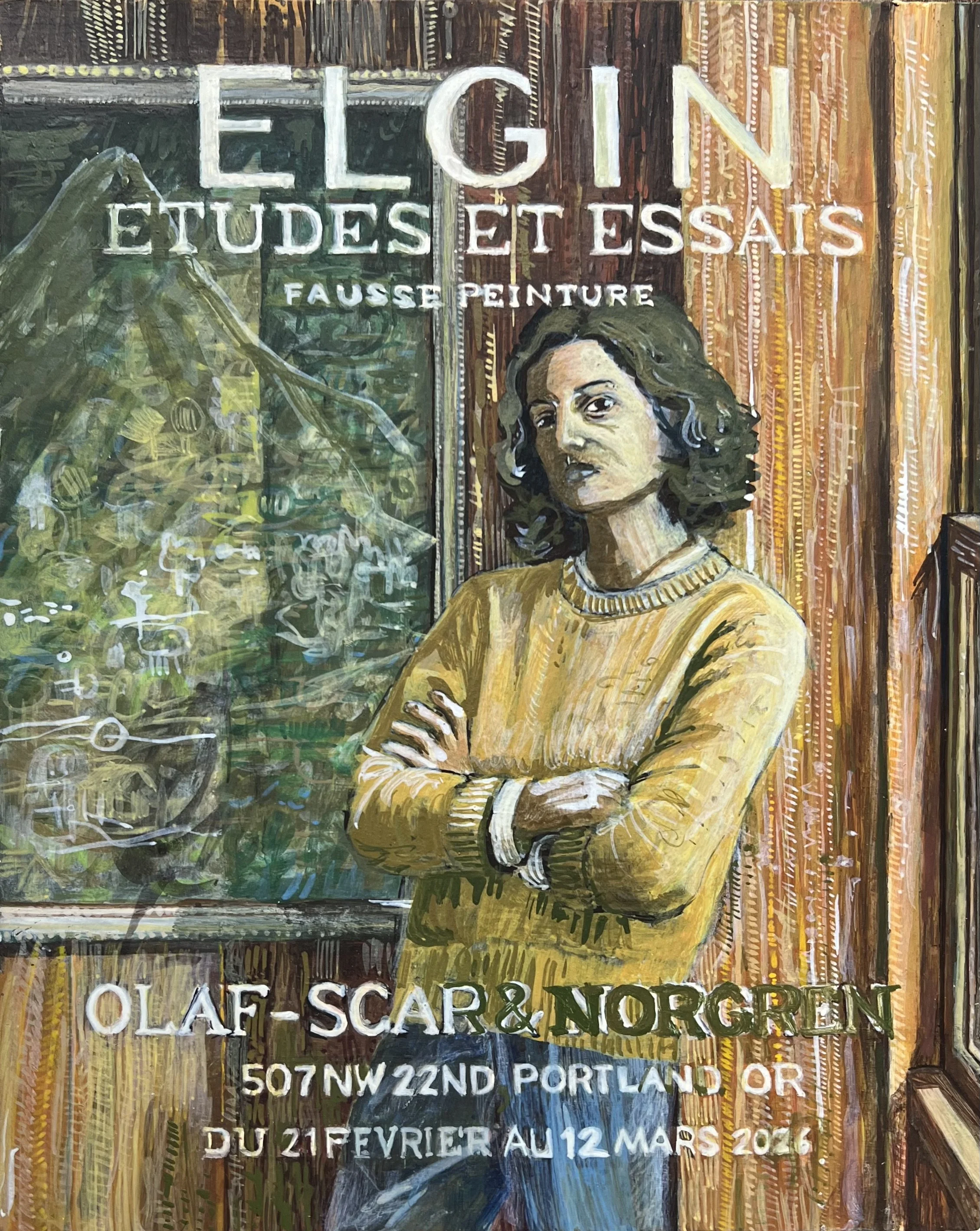
I’m sitting at my desk holding this small, fragile panel, making something tightly engineered, while mentally it feels like being in the middle of a hard-fought battle.
In the end, I had to add something to the picture so I put a vase/flowers below a smaller canvas.
Brice Marden:
Still of Marden in front of a painting in progress
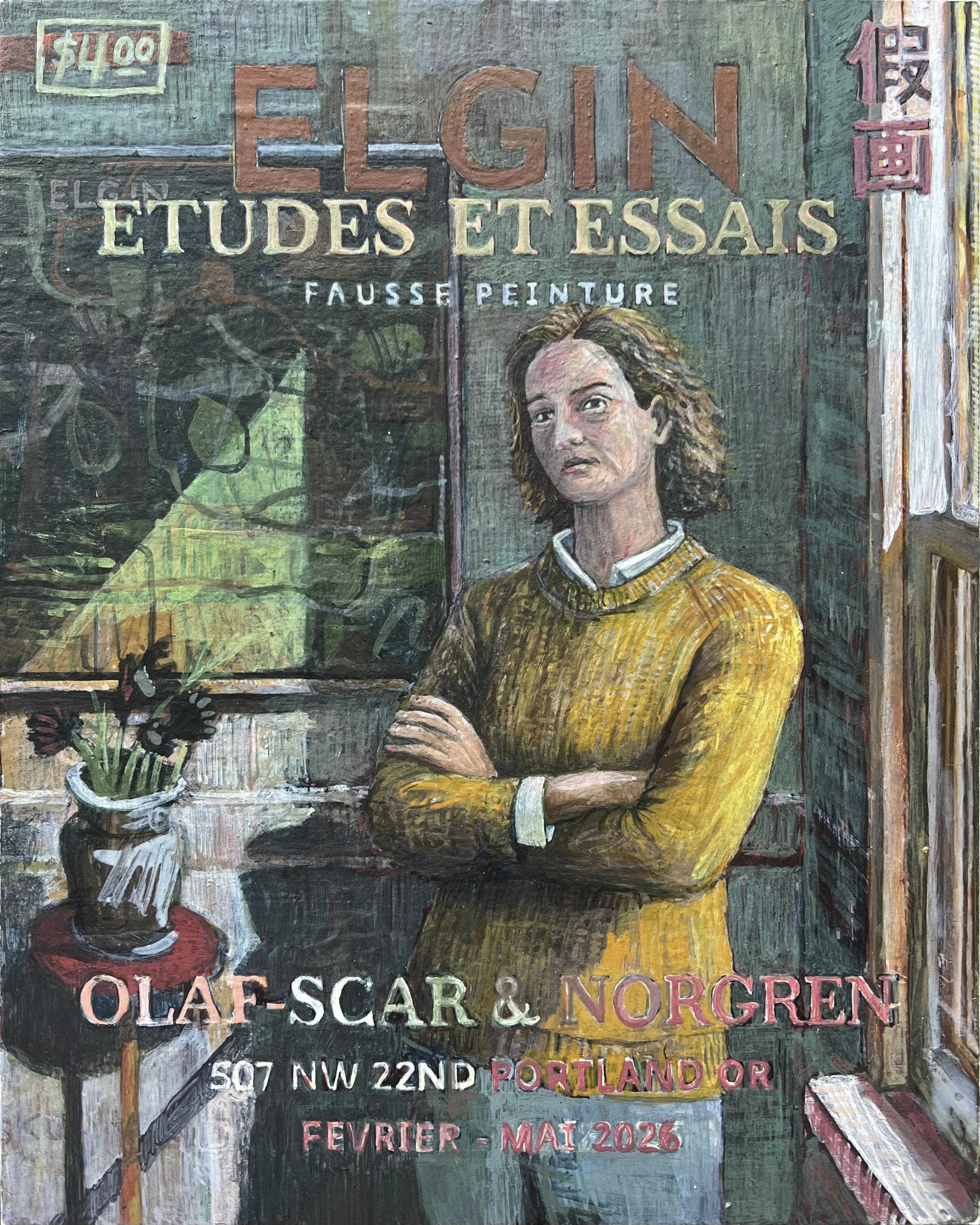
The image in the background gradually shifted away from being a reference to Twombly and closer toward my own interpretation of one of Marden’s line paintings. I started a series of paintings based on trying to follow the rules Marden put in place to govern his Line Paintings. My intent is not to copy a Marden but to think of his approach while working on my pieces.
I think of the secondary artworks in the paintings I’m working on as full artworks unto themselves. What is in the background of this picture is Marden #5. I’m sure I’ll have a lot more to say on these works as I finish and write something about them.
Painting / Technique
This was one of my first serious attempts at egg tempera. I’m still figuring the medium out, but I’m beginning to understand some of the things it can do that oil paint cannot. I’m experimenting with pigment density, transparency, and layering.
Conceptual
Conceptually, this piece is fairly restrained.
Right now I’m thinking a lot about how individual works fit into larger systems. For instance, this work is part of fictional institutions, indexing systems, and symbolic frameworks.
For the images below: I recommend clicking on one, then using the (forward/backward) buttons to scroll through them.

Random Thoughts While Working:
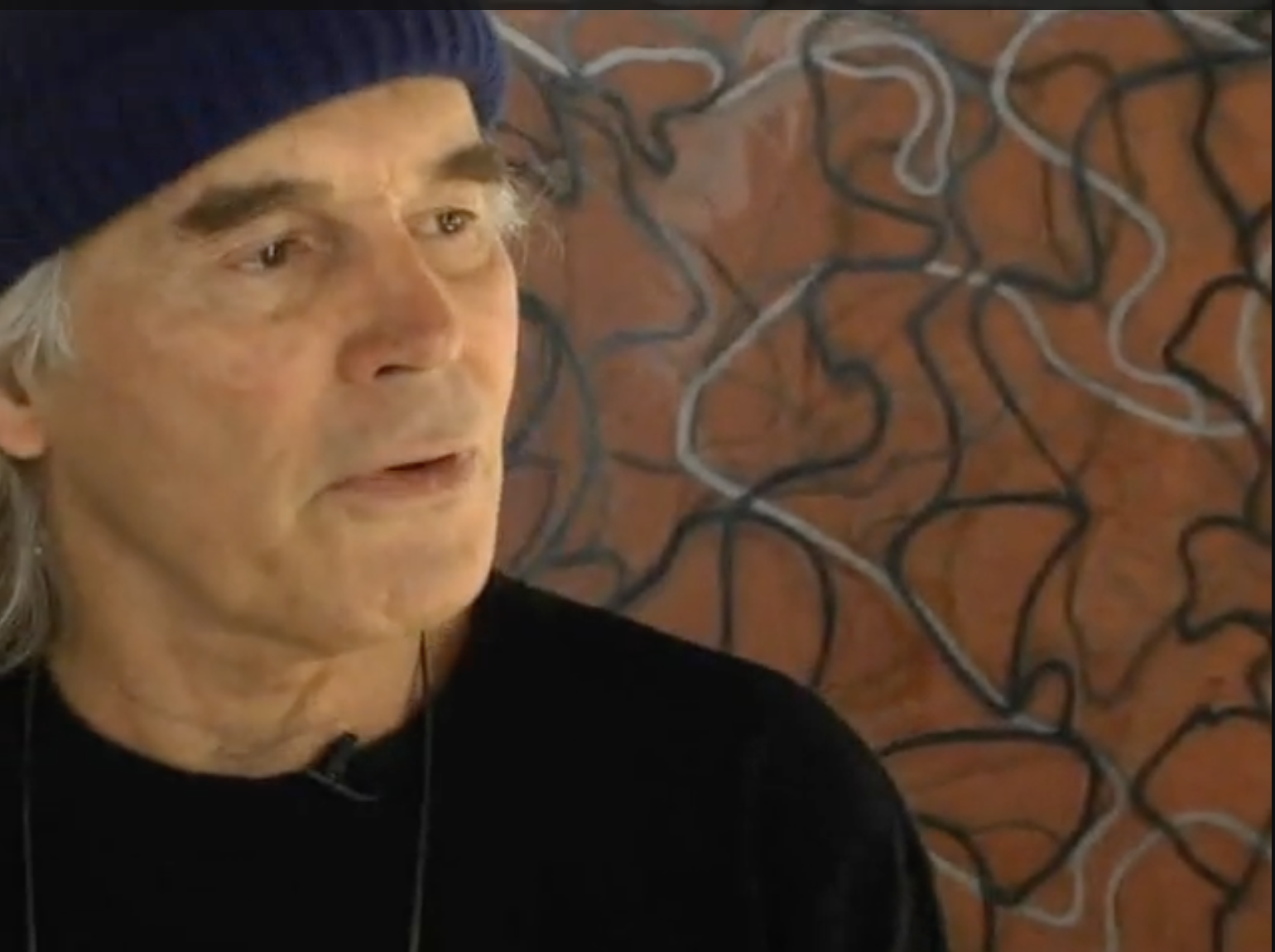
I like how Bacon talks about ‘realism’ and the influence of photography and other mediums on painting. If you start at the 11:55 minute mark and play the video for a couple of minutes, Bacon does a nice job of talking about reductionism in his work.
I spent a lot of time thinking about David Lynch. He is such a bright light. The stories he tells in the brief video below show a genuinely self aware person.