
Etude #39
Goal
Now that I’m finding myself doing a larger series of these face studies based on photographs, I thought I’d try to explore some other conceptual ideas that I’ve been wanting to tackle.
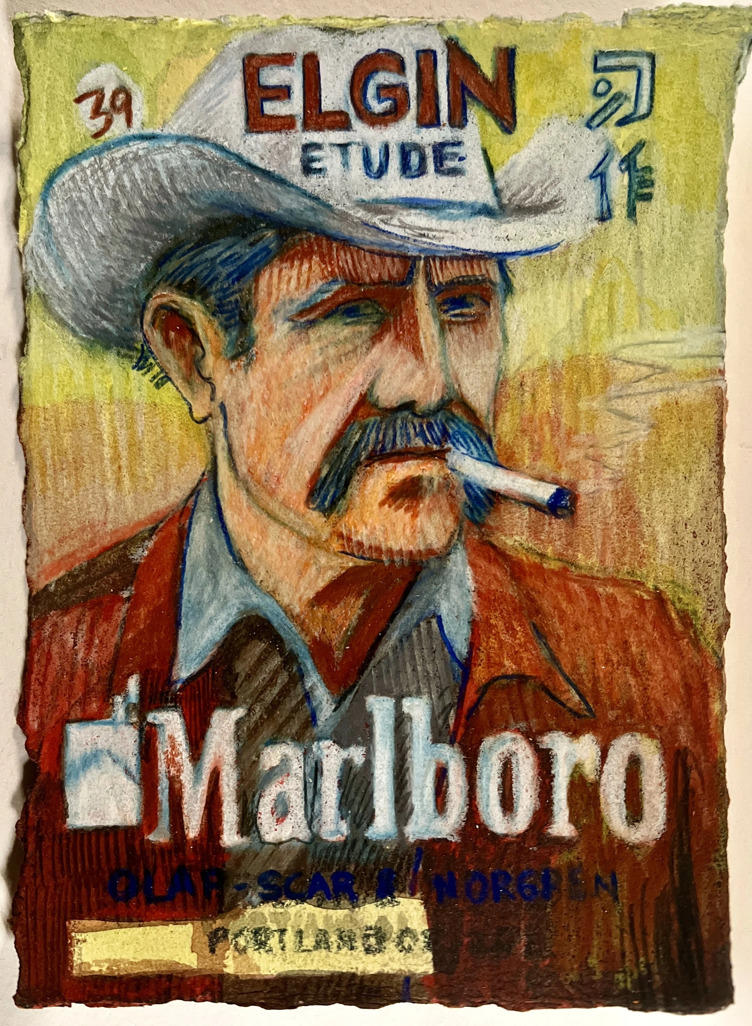
With Etude #39, I thought it would be fun to appropriate an existing brand. Marlboro seemed like an obvious choice. It has one of the most carefully constructed public-facing brands ever created. I wouldn’t be surprised if you added up all of the hours spent on Marlboro advertising campaigns over the years and ended up with the equivalent of tens of thousands of human lives spent crafting this message.
And some of the people making those messages (the creative types who ended up working at large advertising firms) were probably very good artists themselves. They knew how to make an image work. They knew how to make you want something.
That’s what interests me about using a Marlboro ad as the source for this drawing.
When I look at a Marlboro ad, it makes me want a cigarette. Even knowing exactly what the ad is doing, I still get that feeling. Looking at the source material for this drawing, I found myself really wanting a smoke. It’s kind of nuts how much power can be packed into an image.
So I started thinking about whether I could take some of that power for myself.
Marlboro has spent decades building up this imagery. There is all this advertising, money, desire, addiction, cultural history, and commercial energy already attached to the image. I like the idea of appropriating all of that and putting ELGIN on top of it.
Basically, I’m trying to borrow some of the energy that Marlboro spent so much time and money creating and see if I can put it into a drawing.
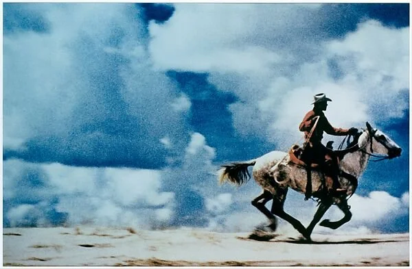
Richard Prince, Marlboro Appropriation
Of course, working with a photo reference from a Marlboro cowboy ad, I have to be thinking about Prince.
I like how where Prince is removing the Marlboro brand to make it his own, I’m branding the Marlboro brand… going the other direction…
I’ll write some on Prince here.
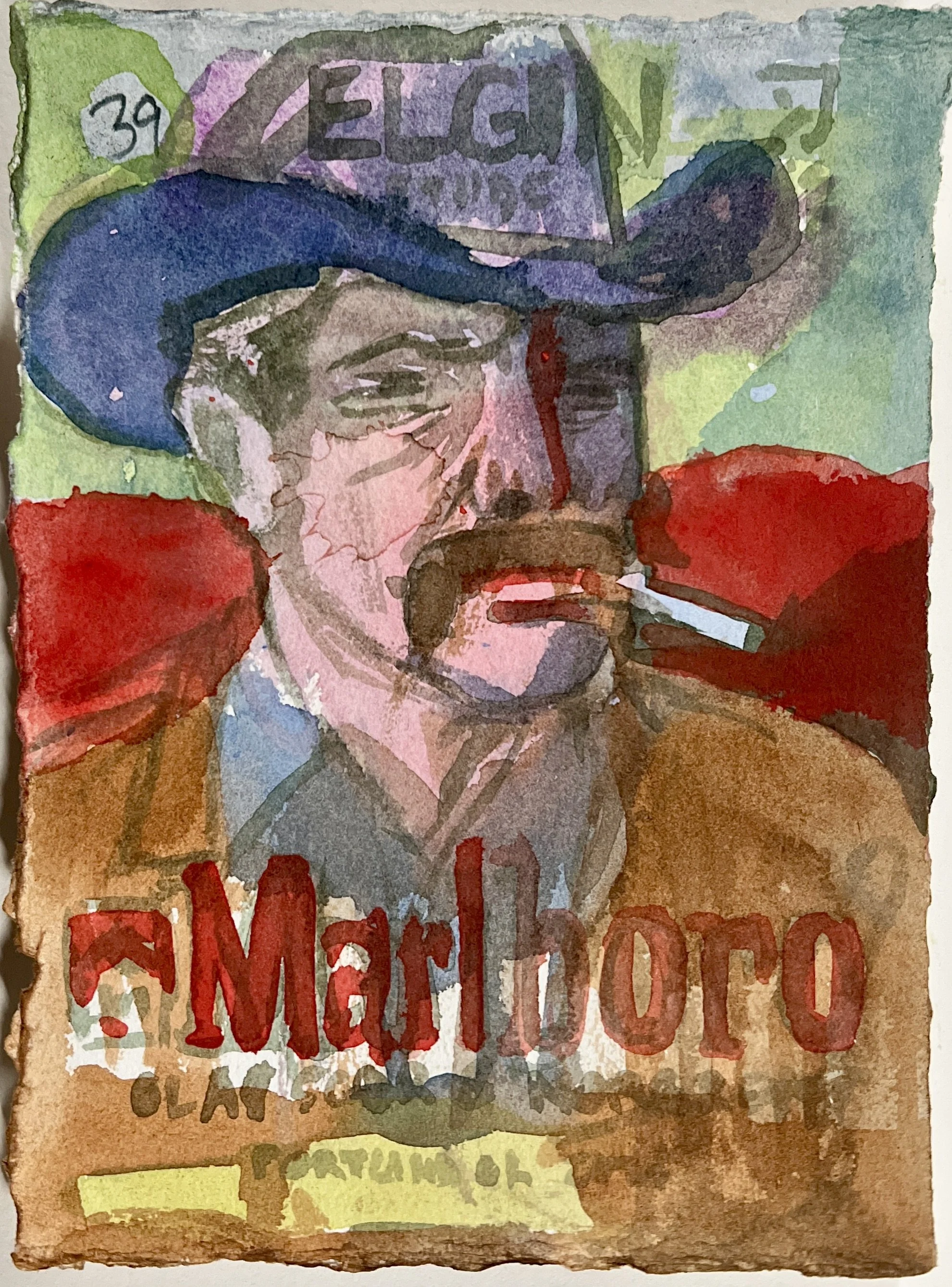
End of Session 3
I like this one right here. I feel foolish for pushing it further.
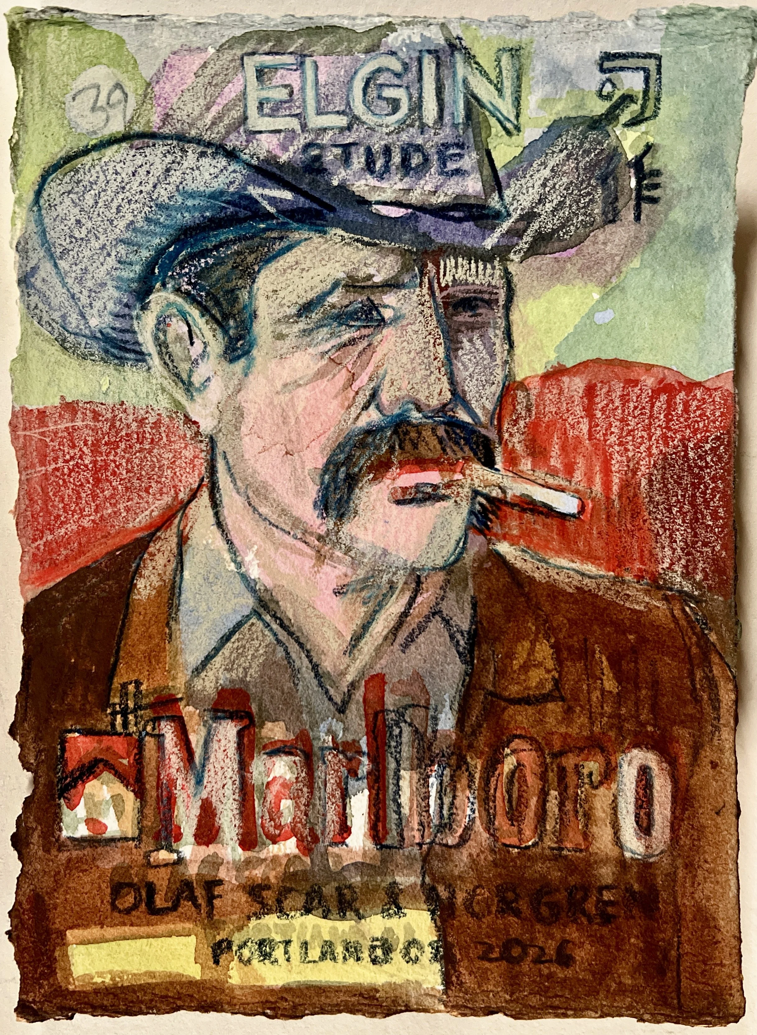
End of Session 4
Its not perfect. But I really like how this is looking. I like the large shapes of color and the occassional slap of frenzied mark making juxtapozed against the red/green…
I think this would make a great print. Not this exactly. But something akin to it.
I would KILL to be able to make a print of this (with a group of professional print makers).
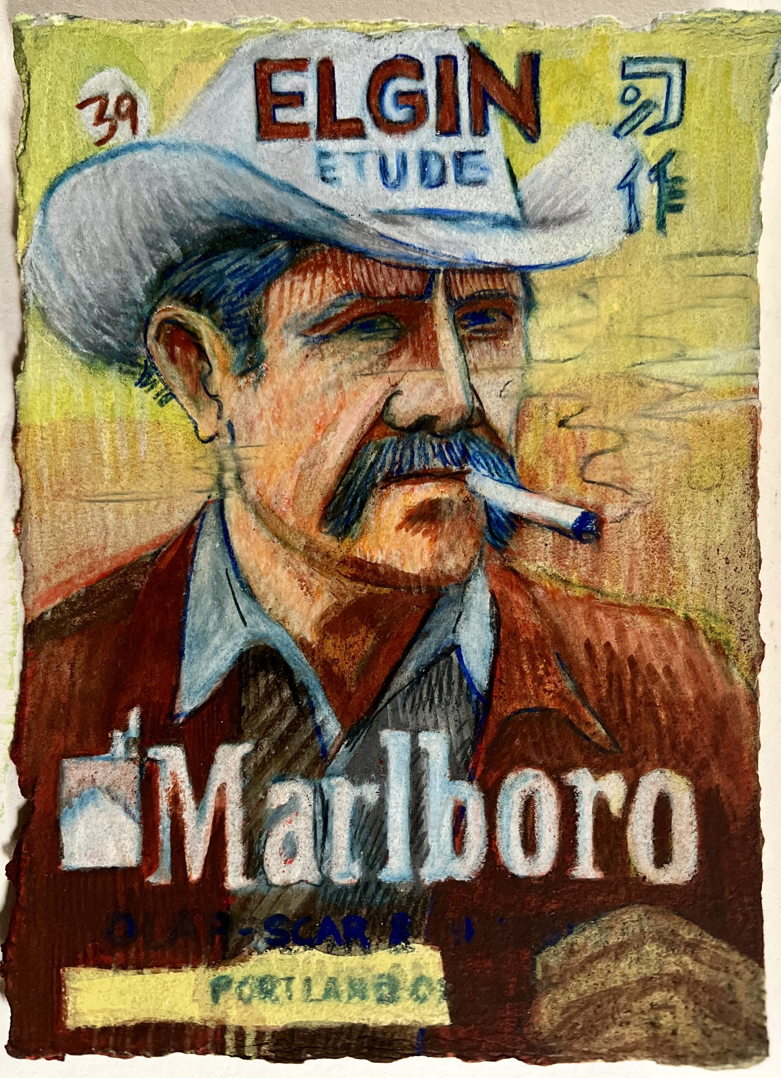
End of Session 7
I can still see where I would like to fix things… but… I’m going to call this done and not worry about super over working it.
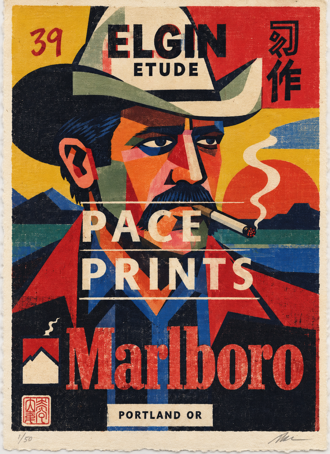
Future?
I think it would be fun to work with a printing house with this as a starting point. For example: what if ‘PACE PRINTING LABORATORY’ were there front and center on top of all this redone as a set of woodblock prints?
(That is an AI generated image)
Judgement:
I’m really happy with this. I plan on trying a few more ‘Marlboro’ appropriation works.
Color: I like it. It could be taken further. Its good. 5/10
Mark Making: I was happy with the watercolor/pencil layering. 6/10
Conceptual: I’m proud of it. If you want to rank this lower, lets hear your reasons why. 10/10
Brand Appropriation: As discussed above.
Etude Series: Explained in detail here: ‘Etude #1’.
Metadata: Explained in detail here: ‘Objets Etranges #1’.
Sociological: I can’t judge my own work. I’d give it a ten. I’m thinking long term. Right now its a zero? I’ll give it a 1 to start because I need something for my algorithm. 1/10
Overall: 5.5
Directions: For best experience, click on an image. Use the (forward/backward) buttons.
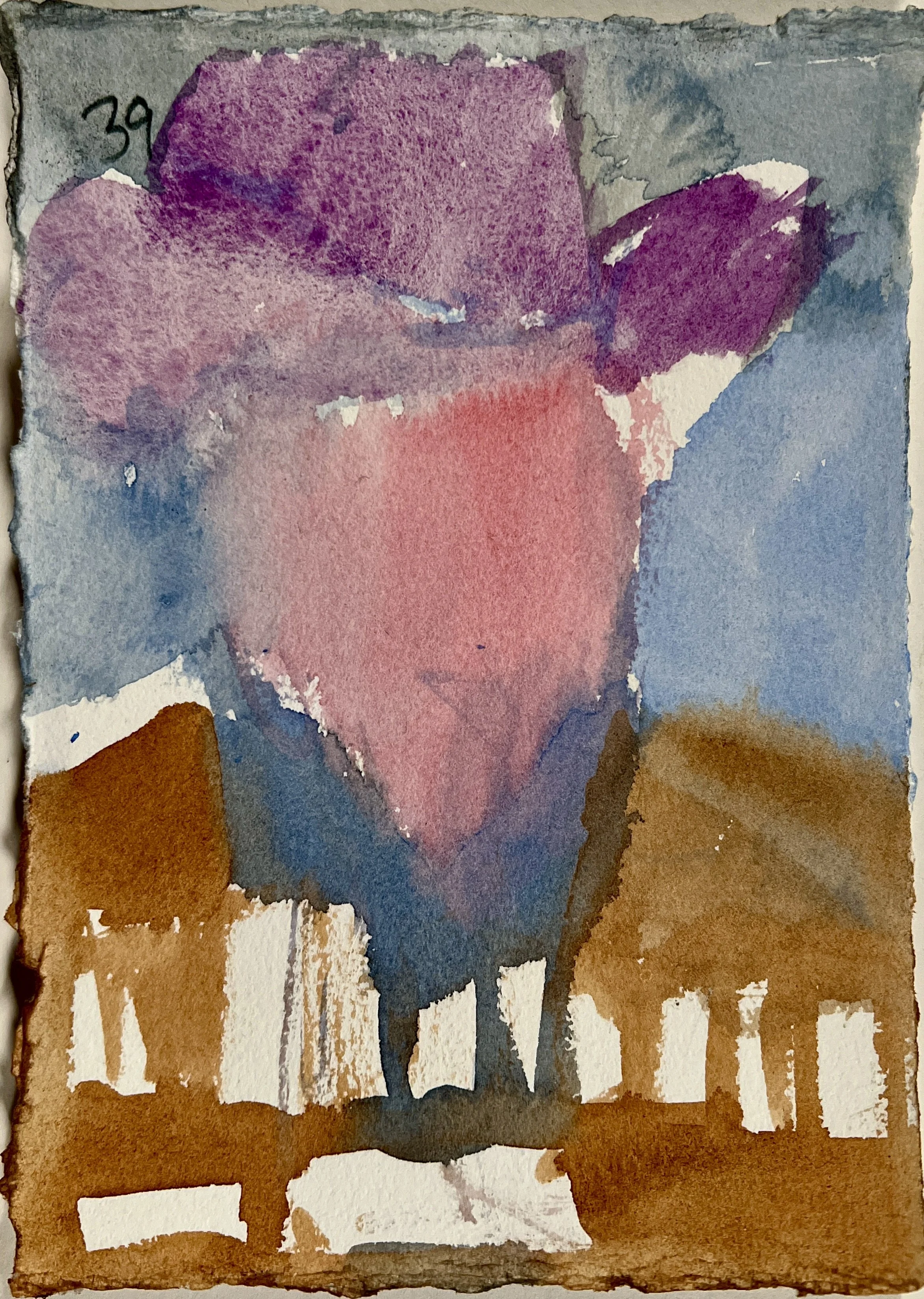
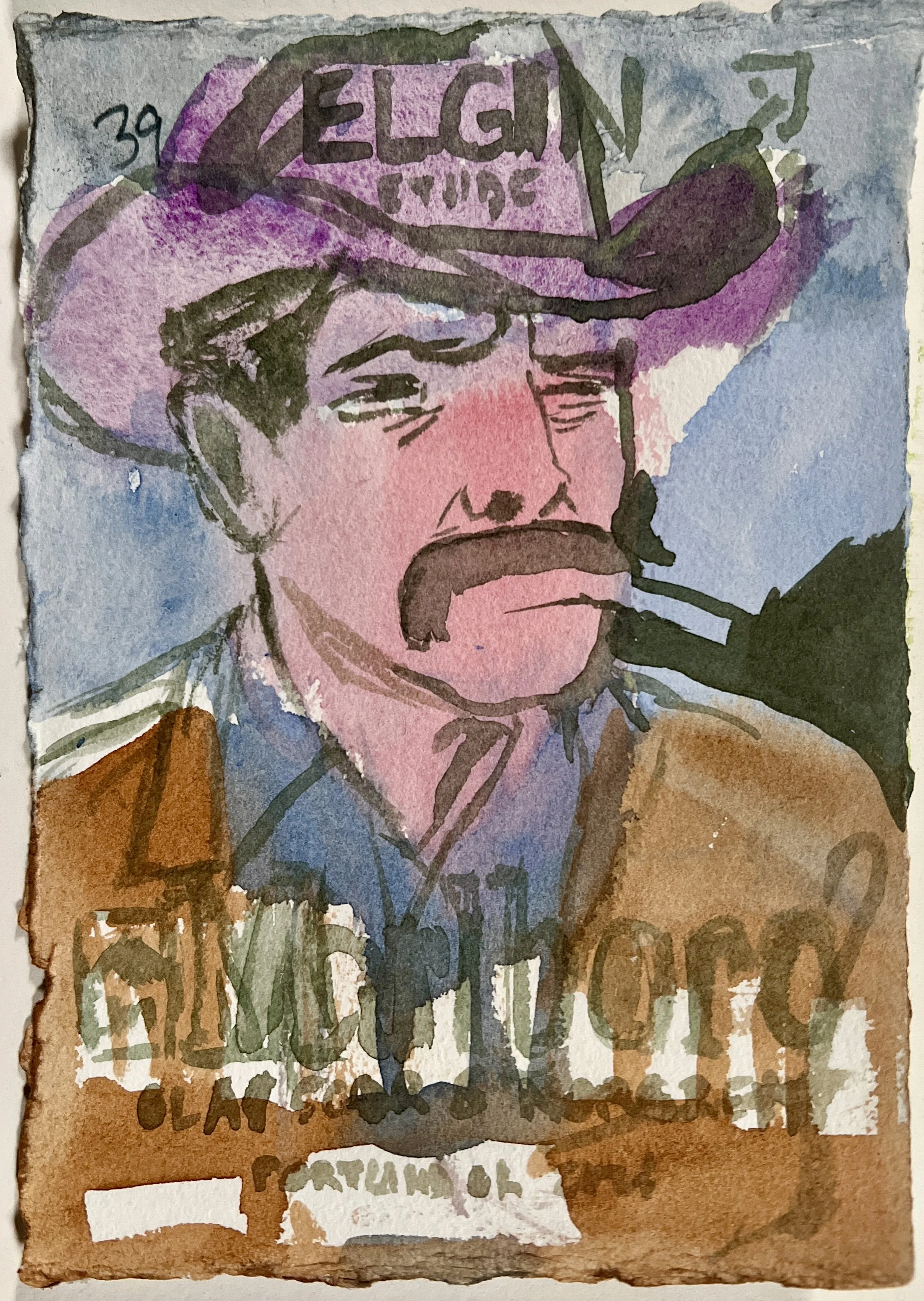
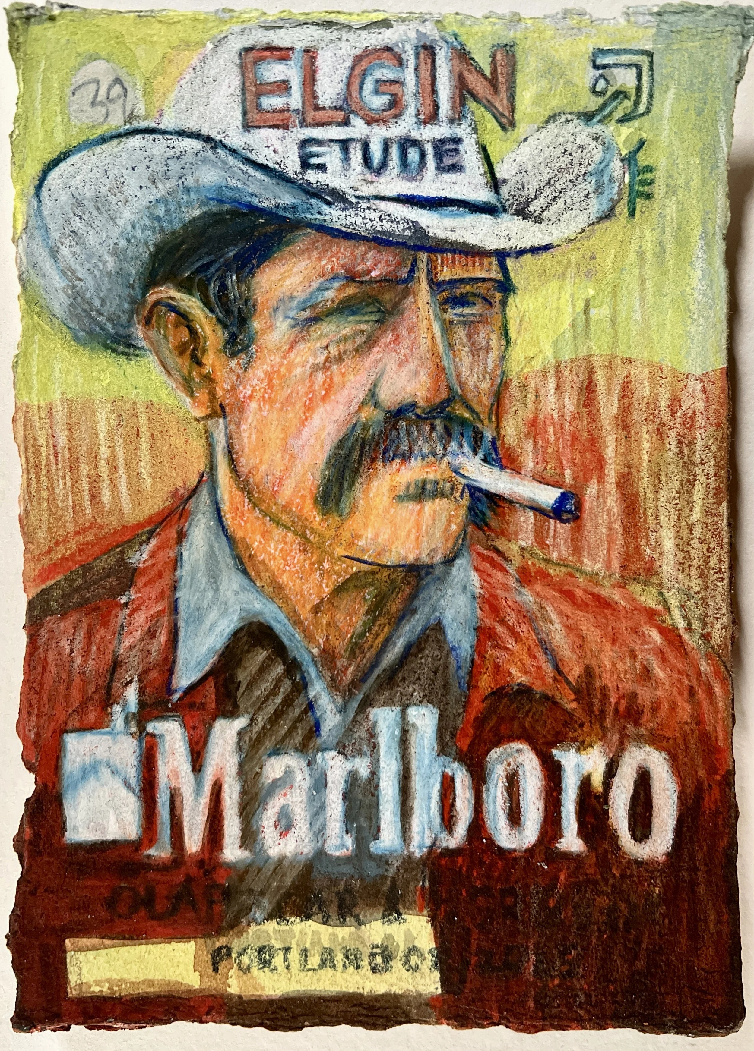
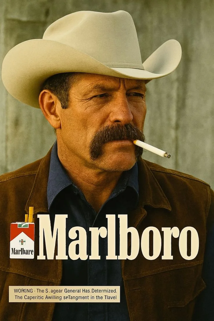
Marlboro Man
Good starting point.
Note: Information on why I’m adding the meta data to the painting can be found here, ‘Objets Etranges #1’.